
This Time Is Always Different, The Key Is To Decide By How Much
Long enough title? William Shakespeare is my 1st cousin, 14x removed. Whatever talent we share, it is clearly not titling blog posts. But then what does he know about markets?
In every business cycle, there are things that are different, but with hindsight that difference is rarely as large as it seemed like it might be at the time. In this post we will look at too many valuation tools, point out one big change, point out a bunch of overstated changes, and then some ideas of where we are today. Basically the “Answer to the Ultimate Question of Life, the Universe, and Everything.” We’ll see if we can do better than just 42 (if you don’t get this reference then Google it).
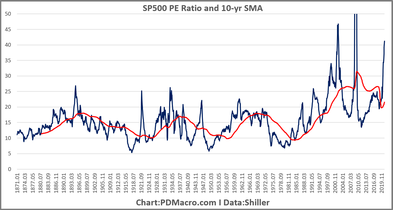
Most of you probably want to know what the big change was in valuation data. When was “this time actually different?” 1982. From 1982 to 1990-95 or so, we saw a revaluation in the stock market. Don’t believe me? Look at the next two charts. The first uses the Shiller data, and you can see that from 1871 to the bottom in 1982 the PE had been cheap in the single digits, and expensive above 20. Literally, if you had known that in 1871 you would have been the richest person on earth just buying in single digits, and riding it up into the 20, and then selling. If your kid had taken over your shop, and continued with that strategy the boy would have nailed the 1987 market, looked like a genius, and then like so many who made the 87 call, would have never bought stocks again. Your FO would have gone from the ultimate hero to a 34-year-long zero.
Maybe the SP500 PE or the SP500 earnings have issues though right? Anything is possible. So let’s look at another metric. Here is the Value Line Median PE ratio. It looks that the entire VL universe of 1700ish stocks, and then combines the trailing six months and the analyst forward six months view, to get the PE ratio for each stock in the universe, and then takes the median. So it looks at large, mid, and small caps. Guess what you can see in this chart? Yep, you guessed it. The PE range shifted higher. We would look father back but the data series did not start until 1973.
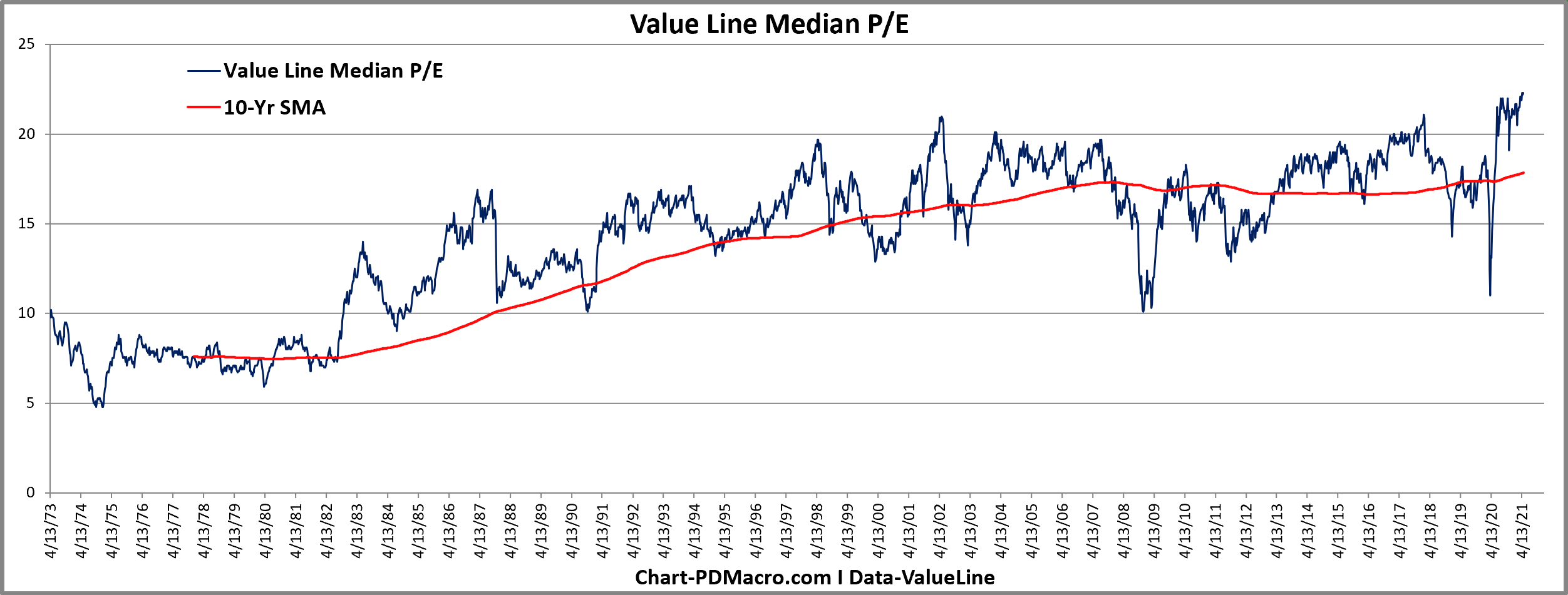
I added the 10-Yr moving average to both charts because I measure the distance from the cycle average to look for extremes. It is clear, at least it is to me, that something happened in the 1980’s. I suspect that it was the beginning of the great bond bull that tool interest rates to lows after lows after lows, down to all time lows+ continued institutionalization of the market into long term funds and indices+ lowering of long term capital gains. All of these combined make some sense to us as to why we shifted what constituted cheap and expensive.
Also worth noting in both charts is that things do not look cheap on an absolute basis, or a relative basis (vs the 10-Yr moving average). And the VL Median PE is at an all time high. This is not a great sign, but also clearly not a great stand alone run for the exits sign as we have been right at all time highs for a few months now without some epic crash. Valuation is a poor short term timing tool…but a fantastic long term timing tool. We won’t get into that today but really if you look at global valuations you can shift from expensive to cheap and over time that works out well…who knew?
So is this time different? Or different enough for us to form a new valuation range? I mean we have flying cars, teleportation, and time travel….wait I mean we have electric cars, SaaS companies, and crypto. Doesn’t this level of innovation mean that the old valuation rules are trash? idk.
Let’s look at some more valuation and forward return forecasting tools. First up is one that we rarely see posted anywhere but we look at it once a week as it is both novel and useful. The Morningstar Fair Value tool. it takes the Morningstar fair value estimate of all of their rated stocks. Above the zero line means it is expensive and a reading below the zero line means it is cheap. We then added the mean, as well as the upper and lower one and two standard deviation lines. Right now it is more than one standard deviation expensive. The work we have done with it shows it has some edge when it comes to forward returns. One of these days we will share that here, but overall we would rate the signal useful but not incredible on a standalone basis.

Next up we have the most loved and hated valuation tool of the last 15 years or so. People seem to love or hate the Shiller CAPE but I think they miss the boat. It is “A” tool, it has some predictive value, it shows you exactly what the calculation tells you it shows, and if you use it as your only tool you are strange at best and a fool at worst. I use all the tools in this post so clearly I am no absolutist. But you do you.
Anyways as you can see the SP500 CAPE is currently at the second highest cycle level ever. Only cycle that had higher readings was that one called the DotCom bubble where we had way too many shitcos and even goodcos that were thought to possess the holy grail from one of the Indiana Jones movies that gave eternal life on earth. As we learned in the deep bear market and recession that followed they in fact did not have that wooden cup. Right now all the CAPE based models are showing a mid to low single digit forward 10-Yr returns forecast. Not awesome.

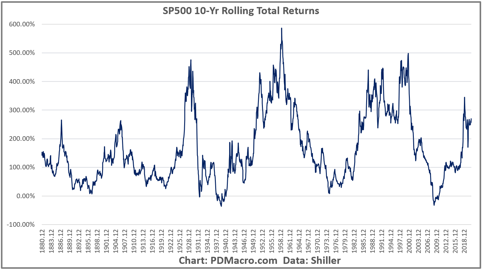
Next up we have the SP500 rolling 10-Yr returns. So every point on the chart is your total return from 10 years earlier. If we look at the current level we can see that the current levels are high, but crazy high. But here is the catch. Look at the last two peaks, then look at the multi-year periods to either side of the peaks, and now look at the dates below. You hopefully notice that since this chart uses monthly data that each peak had multiple years where the market had positive rolling 10-Years. It is not like it shot up to a peak and then tanked to a trough and repeated it. It went up, hung out for a while, made a marginal peak, dropped a bit, hit a different peak, etc., and then hit “the” peak before working its way lower. So a “high” reading denotes a less than optimal time, but is not a strong sell signal. Like a lot of the tools in this post it does a great job of signaling places to buy, but only an OK job of showing times to go to cash. There is a reason we think market timing is a thing to be done in degrees and not all in/all out…but I digress. Next time the 10-Yr returns are negative load the boat, it has a good track record.
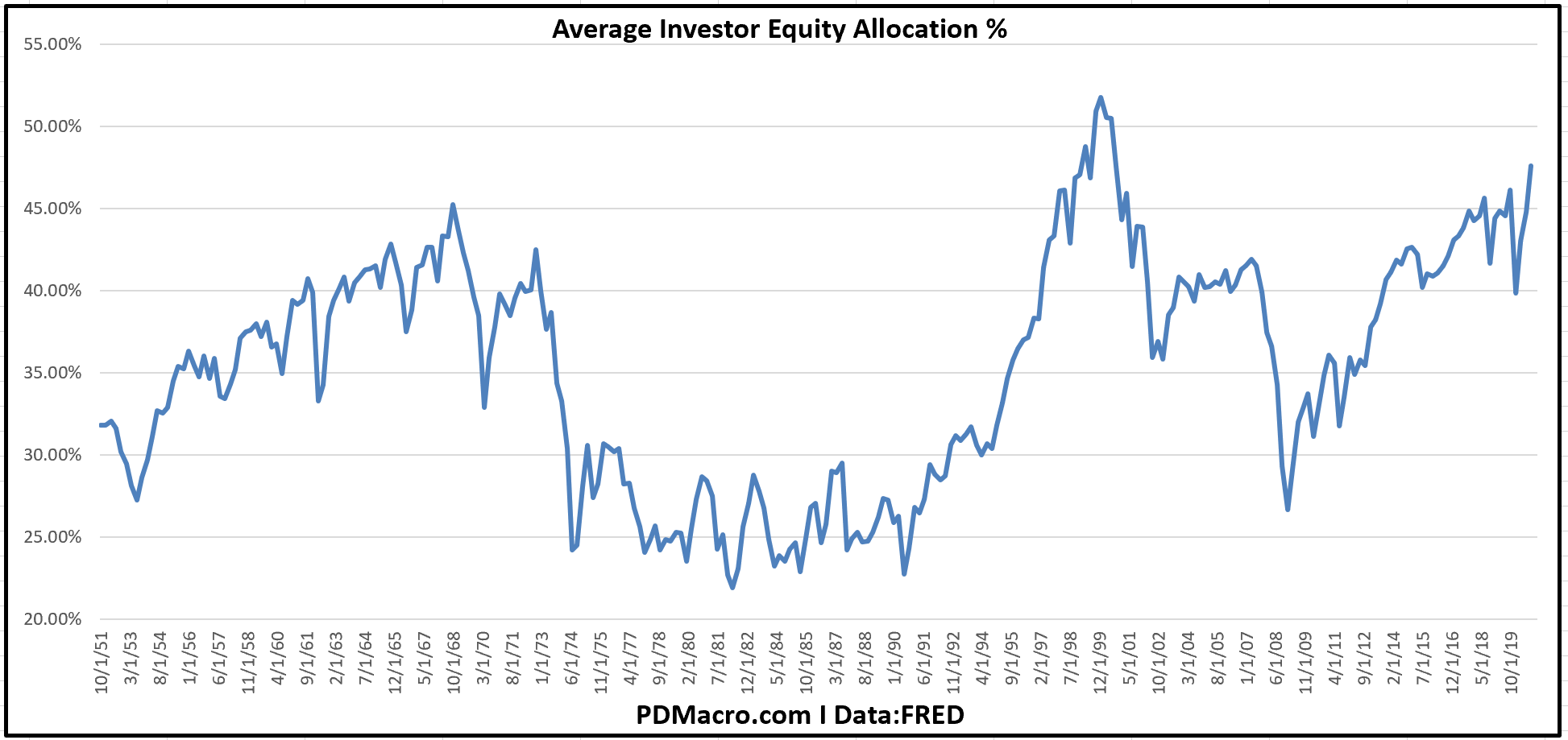
If you follow @Jesse_Livermore on Twitter, and you should, then you know that while he is an anonymous account he is also a great researcher and is very giving of his research. One of his pieces “The Single Greatest Predictor of Future Stock Market Returns” introduced the world to the “Average Investor Equity Allocation” model. This model does a fantastic job of forecasting forward 10-Yr returns based on Fed data on the investors allocation to equities. When everyone is into stocks, and that is a relative version of everyone, then stocks stink, and when no one owns them, they rock. Right now the model is saying that over the next 10 years the SP500 probably sees around 2%/yr. Not exactly awesome by YOLO standards, or even prudent investors standards.
I will end this with one of my favorite numbers, the VLMAP-Value Line Median Appreciation Potential. It looks at the 3-5 yr appreciation potential forecasts for the Value Line 1700-ish stock universe (I say 1700-ish because it ranges between 1695-1705 or so depending on corporate actions). When the VLMAP is high, it is time to buy, and when it is low, it is time to go…or at least to consider going. This series is a strong predictor of future returns and right now it is just off the lowest reading ever that we saw back in 2018. Weird that we have seen the same thing in all seven charts today.

So we looked at seven gauges and they all say the market is expensive, and that forward returns should at the very least be less than they have been the last several years. We also saw that at least one time (1982) things actually were different that time. So do you think rates are going lower, long term capital gains taxes are going lower, and the market is going to get even more institutional? If not then you need to either justify current valuations with some other argument, or you need to figure out where your returns are coming from moving forward since US stocks, and specifically US large caps, are very expensive.
And before you say “but this market is not like 2000 and the DotCom bubble” please realize that most of the charts we looked at have over 50 years of data, and the ones with Shiller data go back to 1881. The DotCom bubble was the most expensive, but it was not the first bubblicious market. So do SaaS companies, EV companies, and companies loading their balance sheets with crypto justify a “new era” for valuations? Some new permanent plateau? Anything is possible I guess, but all history, data, and sense, suggest otherwise.
This is not an immediate market call, not just as a disclaimer, but also as an actual call. Valuations take time to work themselves out up or down. But over the next 5-10 years, and probably even 2+ years, this stuff will matter, and while everyone thinks they will see the signs and be the first ones out the door the reality is that only one person is the first one out the door. Are you Usain Bolt? If you are then idk what to tell you, you are really fast. But if you are not then you need to make other plans.
Here is an idea-there is an entire world out there.