
Three months into the year and we have seen rate cut expectations go from 6-7 to 3-4 to 2 to…maybe none.
For a long time, we have seen people say half-seriously that the Fed could be managed by an algo. Some have suggested the Taylor Rule and others just say use the 2-Yr yield.
Before we start let me say that I know the Fed is not model bound. They have even gone out of the way to say it before. And yet here we are. Models don’t have to be followed; they can be observed if over time they give useful views into the data.
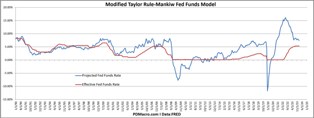
If we look at the Taylor Rule-any of the variations look similar but here is the Mankiw mod-we see a gap between the model and the current rate….and the gap says rates should still be higher. In the case of the Mankiw mod rates should be higher right now. If you look at other versions the rate is either a bit too low or a bit too high, but none of them show a huge need to cut, or for that matter to hike.
If we look at the 2-Yr yield as a market-based forecast for the shorter end of the curve then “the market” is saying rates aren’t going lower anytime soon. The 2-Yr has basically gone nowhere for over a year now.
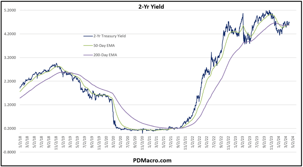
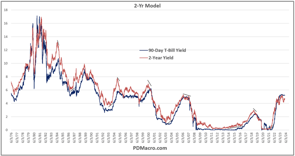
In case the 2-Yr idea is new to you then here is a longer-term chart showing how the 2-Yr tends to lead short rates at the major turns.
Now the Fed has a dual mandate of full employment and price stability. For a while now it has seemed like we have more or less had full employment. As for inflation, show me where it is still plummeting towards the mythical 2% level. Yes, in many areas it is still moving lower, but the pace has slowed considerably, and in more than a few areas it looks likely to move back up at least a bit in the coming months and quarters.
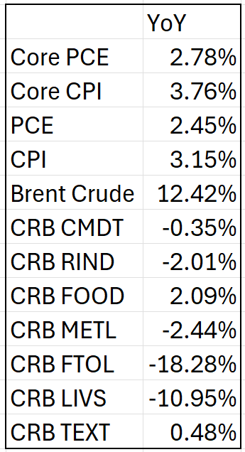
Here is a non-exhaustive table of different inflation measures. I almost put in all the PPI measures but decided not to do that to you.
Now let’s look at some charts.
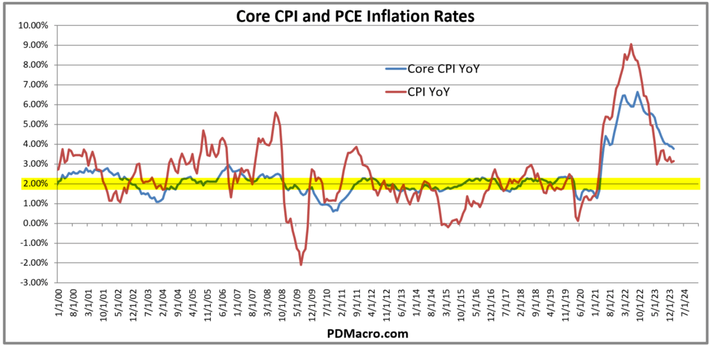
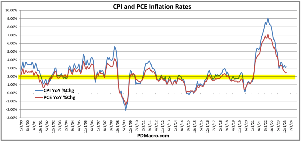
First up is Core CPI and PCE. The PCE is the preferred inflation number for the Fed and as you can see it is falling, is only at 2.78%, and the pace of decline is slowing. In the case of Core CPI it is down to 3.76% and stalled out a few months ago. You see the big yellow highlighted 2% line? It is not being touched yet, and barring a total collapse in inflation it wont be touched for at least a few months.
What about headline PCE and CPI? Headline PCE is actually close to 2% with a reading of 2.45% and dropping at a decent clip. Headline CPI on the other hand has stalled out at 3.15%.
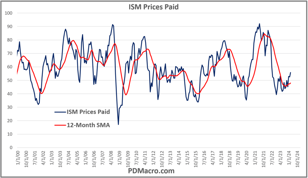
If we look at the ISM Prices Paid Index, usually a leading inflation indicator, we can see that not only has it turned higher but it is above 50. The ISM indices are diffusion indices where anything above 50 is growing and below 50 is contracting. As you can see the Prices Paid index is growing, indicating that manufacturers are paying higher prices for their materials to make their products.
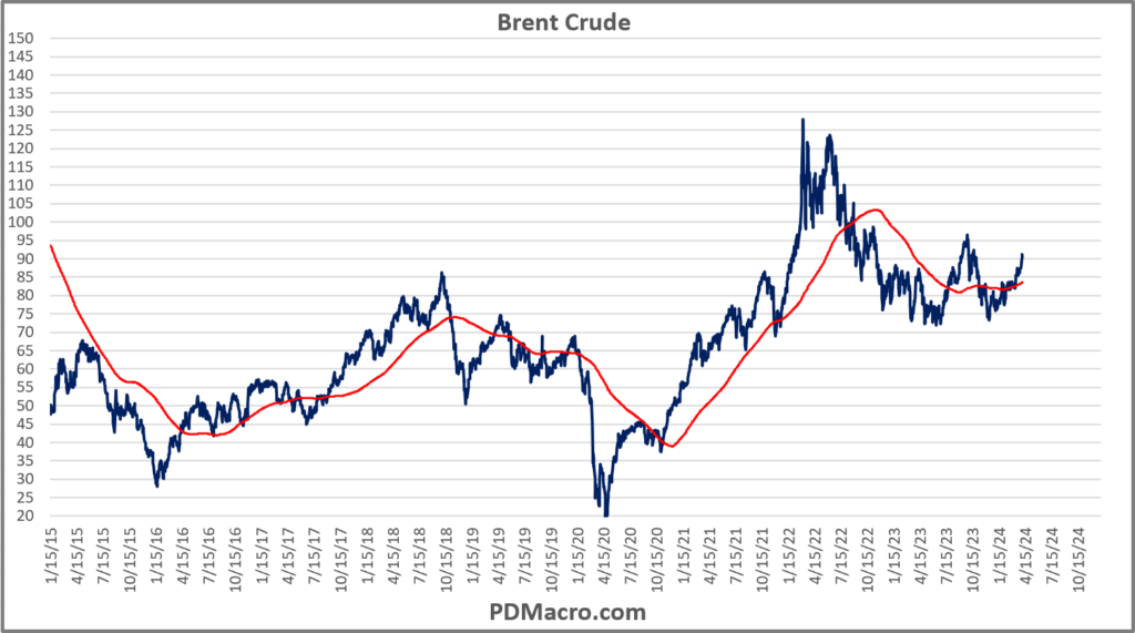
Crude Oil, one of the classic inflation leading and coincidental indicators, is moving higher. After a nice fall the price of crude has been moving higher for a while now. Brent is up 12.42% YoY.
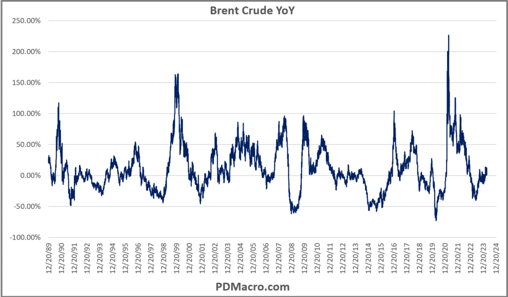
But it looks a bit worse than that, at least to me. Look at the price chart of Brent. It stopped going down a while ago. Over 18 months ago really. I know core measures strip out food and energy, but this explains a decent amount of why the CPI numbers have stalled and PCE has slowed.
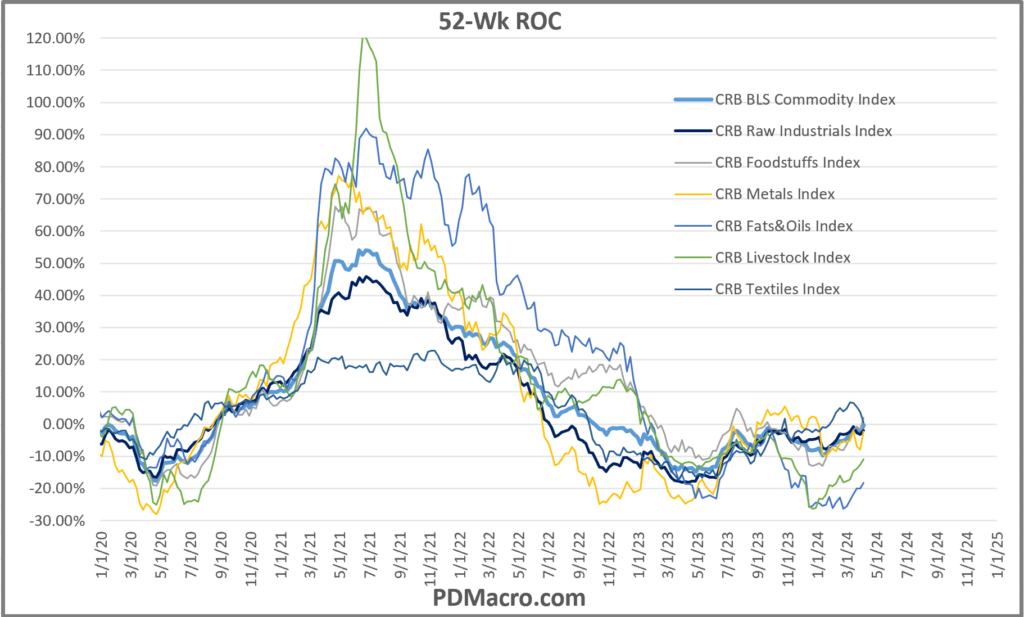
I like looking at commodities because while they dont always give the cleanest signals, they do lead economic numbers. If we look at the CRB Sub-Indices what do we see? They all look similar to crude oil. And aside from textiles which dipped the last few months, they are all moving higher. Some are still negative on a year over year basis, but they are all recovering. Not exactly a sign of rapidly falling inflation.
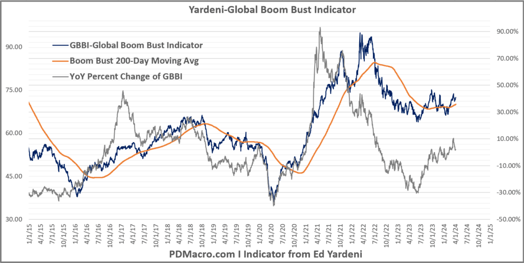
Finally, at least for now is the Yardeni Boom Bust Indicator. Made up of Brent Crude, Baltic Dry Index, and the CRB Raw Industrials Index it is a decent global growth indicator and a quite good emerging market growth indicator. In this chart we have the price and 200-day moving average, and then in gray we have the YoY of this index. As you can see the YoY is positive and rising, and the price index is working its way higher. So even though China has been very mid in terms of growth, overall the world is doing more trade at higher prices. Usually this is inflationary, not disinflationary.
What about employment? The Fed has a dual mandate after all.
Well a few months back the case was easy to make that a lot of employment indicators were looking close to breaking down, a few still are. But, and it is a big but, more than a few indicators are pointing to an improved employment situation with more wages and some growth.
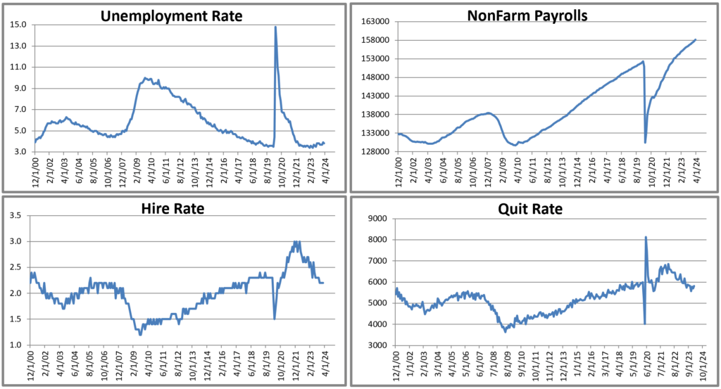
First up we have four charts of the unemployment rate, nonfarm payrolls, and the hire and quit rates. The hire and quit rate continue to slide, but the NFP numbers have been great and unemployment continues to hold up.
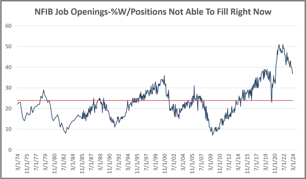
Two indicators I have been watching, and that are still not in great shape, are the NFIB Job Openings and NFIB Hiring Plans. Both have been sliding for a while now. If we look at Job Openings now vs previous cycles I am not sure it looks so bad. I don’t love the fall, but it is coming off the Post-COVID move, and is basically where it was at the last peak level.
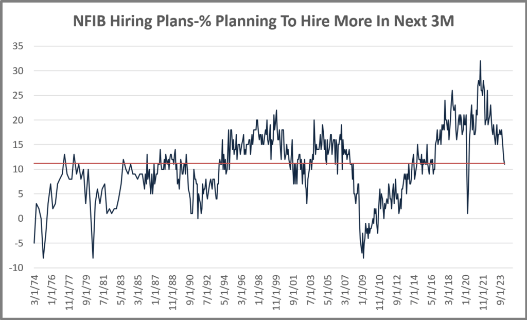
The NFIB Hiring Plans on the other hand has slid to the long term average level, and the last reading could be described as plummeting.
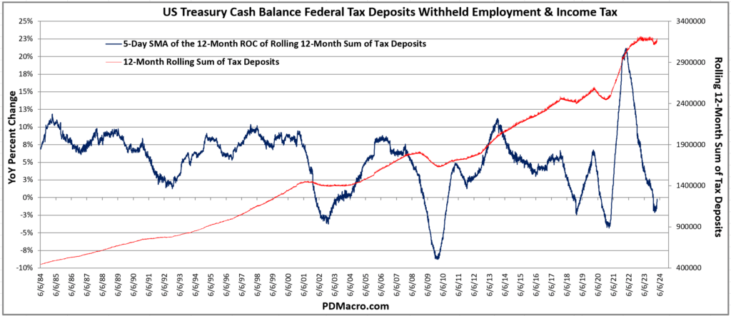
if we look at wages we think we have seen the turn higher. One of our favorite data series is the US Treasury Daily Tax Deposits and Withheld Employment Tax series. It is real time daily data into what the Fed is getting in taxes. Consequently it is a great real time indicator. In this first chart you can see the smoothed data series in red, and then the year over year change in blue. The red line stalled for a year. It was flat as a pancake for over 12 months. But over the past four month it has started to rebound, and is almost positive on a year over year basis. So not only did wages not break lower, but they are starting to move up.
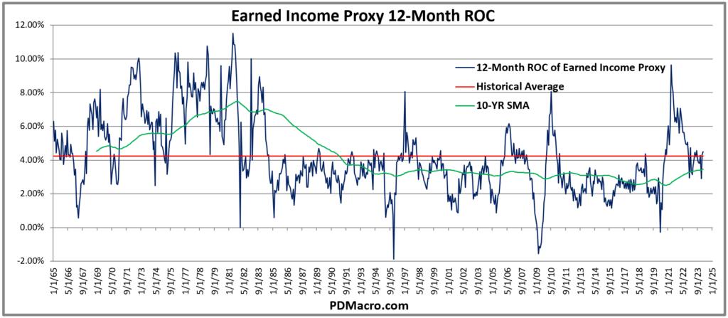
This matches up with the Earned Income Proxy. Taking the (Avg Hours Worked x Average Dollars Per Hour) x 52 weeks we get a proxy for what people are making. If we look at the year over year measure you can see that not only has it stopped dropping, but it is both positive and moving higher on a year over year basis.
So inflation is not dropping like a rock and some of the leading indicators are suggesting it might move higher, and employment is quite good and pay is starting to move up. What about general growth or earnings, or even just general economic activity?
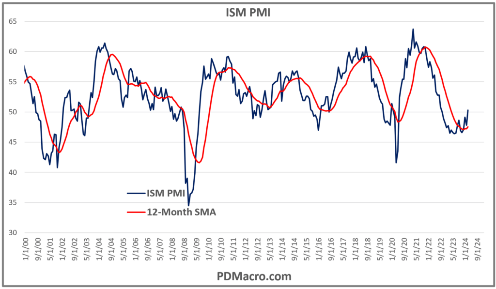
The ISM PMI is not perfect but it is a good leading indicator of GDP. Not only does it appear as though it has bottomed, but it is also above 50 indicating expansion.
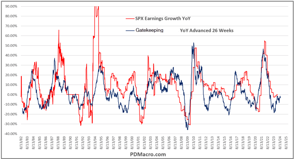
What about SP500 earnings? We post a stupid simple model on Twitter occasionally. It is the SP500 earnings year over year overlaid with a specific index year over year advanced 26-Week aka two quarters. We are gatekeeping the index here, but it has a good track record and a decent r2 to earnings.
Our stupid simple model bottomed and right on cue we are seeing earnings growth start to recover. End of times it is not.
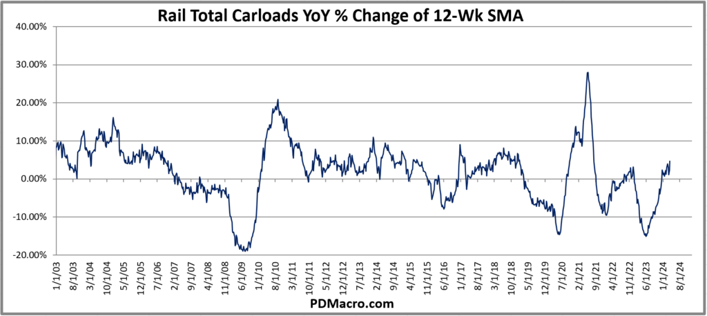
Finally we have the Rail Total Carloads year over year. I literally chose this chart because I had already grabbed it for something else, but guess what? The railroads are moving more and more freight. Almost every growth indicator has hooked higher, and in some cases like rail loads it has been moving up for several months.
Fed Speakers
Why this piece with a million charts? Well aside from the fact that I love charts, it is because over the past few weeks the talk of “how many rate cuts will we get in 2024?” has reached a crazy level considering the backdrop. And yet it is not just from the talking heads, but also from the shot caller. Jay Powell continues to imply that cuts are coming while also reiterating that inflation and jobs are still strong enough that they don’t want to cut yet.
And then Bostic said that rates should probably not be cut until the 4th quarter. Kugler then basically said the same thing.
But then Kashkari said that maybe no cuts in 2024 was possible.
So yeah, the Fed Dot Plot says cuts should come this year, Fed Funds Futures now imply two cuts, and way too many other people are talking about cuts…but the economic backdrop does not currently justify it, and don’t show signs of changing anytime soon.
What Would Change This?
If they follow the Fed Mandate then the only thing that would really call for cuts this year would be for employment to crater. If inflation craters but employment stays solid then I don’t see why the Fed would waste cuts on nothing. They could, but it would be a weak case and in an election year it would probably be construed as being political.
Which brings me to my last point. If they cut rates at the June meeting, and Putin has not hit the red button, then the cut is political. I think the Fed tries to stay out of normal DC as well as can be hoped, and yet they are part of the system. With the data as it is, and their comments over the past few weeks, any cut before later this year assuming a lot of mediocre and bad data comes in, would be political. Not saying it will happen, but I am saying it would look that way and is the only reason to do it sooner than the data justifies.
My hope is that JPow remains apolitical-ish. My view on rates is that we don’t see any cuts in 2024, and am starting to think the 2-Yr breaks higher in the coming weeks. Make of that what you will.
Happy Trading,
P.S. If you liked this then take a free two week trial of our service. If you have any questions send me an email or find me over at Twitter @DavidTaggart