The Yield Curve And The Stock Market 1962-2024
The Yield Curve Is Usually Used To Help Forecast Economic Expansions And Contractions, But What Happens To Stocks?
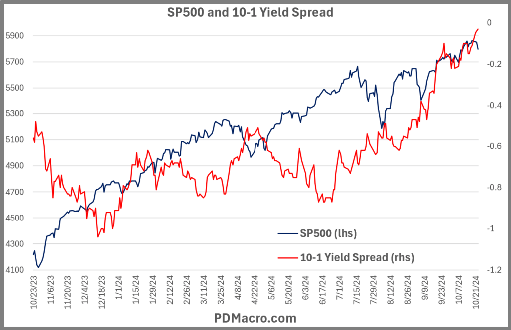
Over the past two years (since July-October 2022) we have had an inverted yield curve in the United States.
During that time we have heard pundits and practitioners predict recessions, slowdowns, and market crashes. But what actually happens when the yield curve inverts, and what happens at other points in the cycle?
Using the spread between the 10-Year and 1-Year Treasury Yields we break down the yield curve and look at one year returns in the SP500 from five different points in the yield curve.
In what shouldn’t be much of a surprise, the market is usually relatively weak when we have an inverted yield curve and is usually stronger when the curve is positively sloped. But it varies a LOT from cycle to cycle.
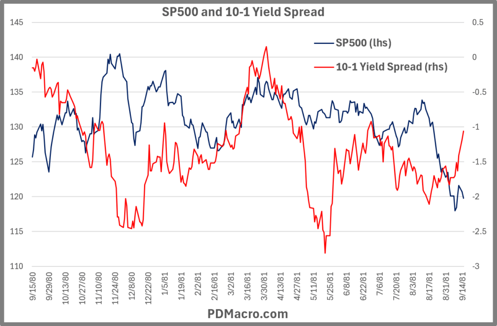
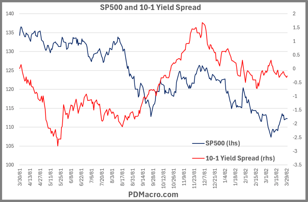
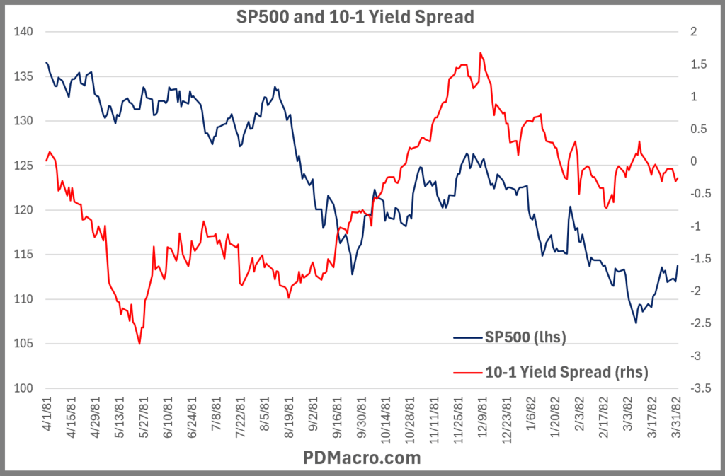
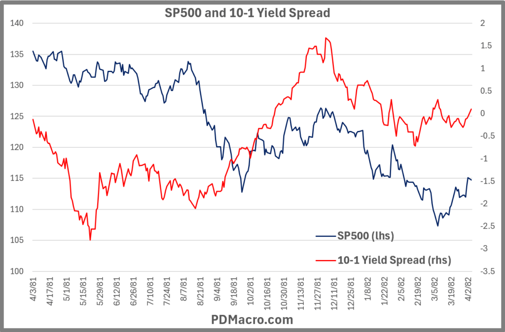
For instance when the curve inverted in 1981 the SP500 was down from the peak, from the first break, from the trough, and even once it turned positive one year later. A brutal inversion, and one that directly followed another inversion.
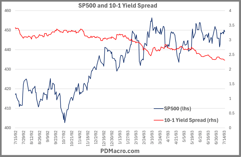
On the bullish side the inversion of 1992 saw a market that was like the honey badger and it just did not care. From the first break the SP500 was up 27.71%, from the inversion and trough it was up 31.64%, from when it turned positive it was up 34.61% one year later. In fact that inversion only lasted about a week.
Now you might be saying “but then does that count?” And it is a fair question, but when you look at how people were thinking in 1992, the answer is yeah I think it should count.
How We Set Up This Study Of The Yield Curve & SP500
In the Post-WW2 period the yield curve has a very good history of calling recessions. Usually we see a recession about nine months after the yield curve inverts, but this is not always the case, and as of right now (10/25/24) it appears, to not be the case today either. One could still come, but it is not looking very ominous at the moment.
A few things worth nothing about the data and timeframe we used:
-FRED has the 10-Yr and the 1-Yr yield going back to 1962 on a daily basis. Also anyone with an internet connection can go get this data and use it.
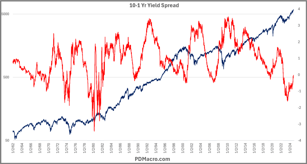
Here is the full chart of the 10-1 Yield Spread. The shaded areas are when the curve was inverted.

-SPX price only data, so no dividends are included, so returns would actually be a bit better over time.
Here is a chart of the SP500 data with log scale, and the 10-1 Yield Spread over the entire history of this piece.
We chose the Peak, First Break, Inversion, Trough, and Positive as our phases. Most of those are fairly self explanatory but the first break is a bit different so let’s go though all of them real quick
Peak-the peak is the peak before the curve drops and inverts. After doing the whole study it occurred to us that it probably makes sense to look at the peak as the peak after the curve goes positive, but we did the peak first. The peak is the absolute highest YC reading between inversions. The highest peak was 353bps and the lowest was 15bps, so you can see they vary a lot.
First Break-in most cases before a “real” inversion we see a few days where the curve goes negative before a sizable move higher, and then the eventual push lower into negative territory. So we decided to include this as a phase since you will hear on the news, and see on your screen, when the YC inverts the first time. Sometimes however the curve just goes negative and never looks back. In those cases we use the same data and data for both the “First Break” and the “Inversion.”
Inversion-the inversion is when the spread between the 10-Yr and 1-yr yield goes negative and stays that way for a while. When you hear that “when the yield curve inverts we see a recession” this is the time they are talking about.
Trough-the lowest point in the cycle between the inversion and the peak. The lowest trough was -344bps and the shallowest was -2bps, so they can vary quite a bit.
Positive-this is when the curve goes from inverted to positive sloping. So when the 10-Yr yield is higher than the 1-Year yield.
There are a few times when you could say it was the same interest rate cycle, but we are trying to look at it as if you are trading when it happens, so if it looked like it was a real move from the trough to positive territory and then turned down, then that is counted as a cycle.
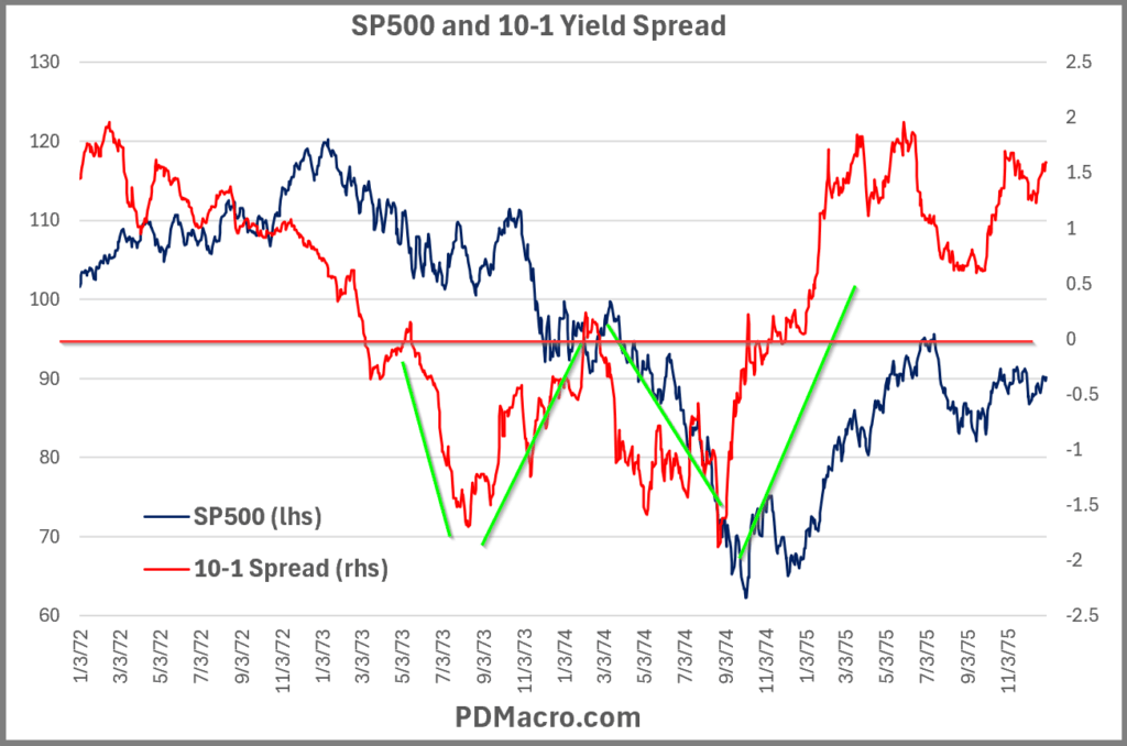
A great example, maybe the best one, is in the 1973-75 inversion. It went from positive to negative -150+ bps, rallied to be positive, and then plummeted back to below -150 bps again. In our counting this is two yield curve moves and not just one. Another great one is the 1980-82 period where rates and markets went kind of crazy.
Yield Curve Phases Across 14 Interest Cycles Since 1962
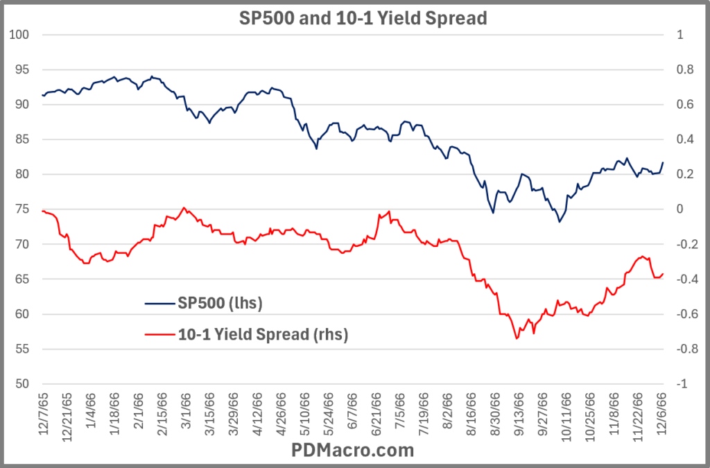
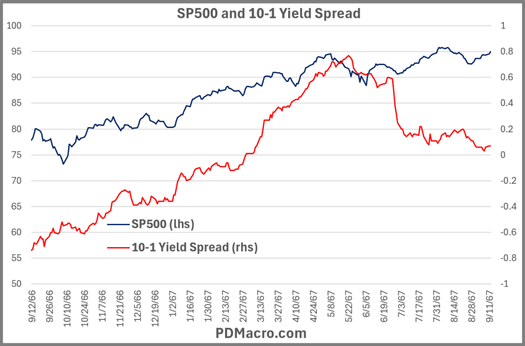
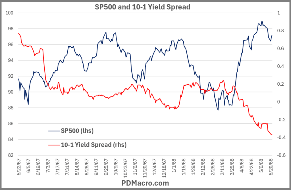
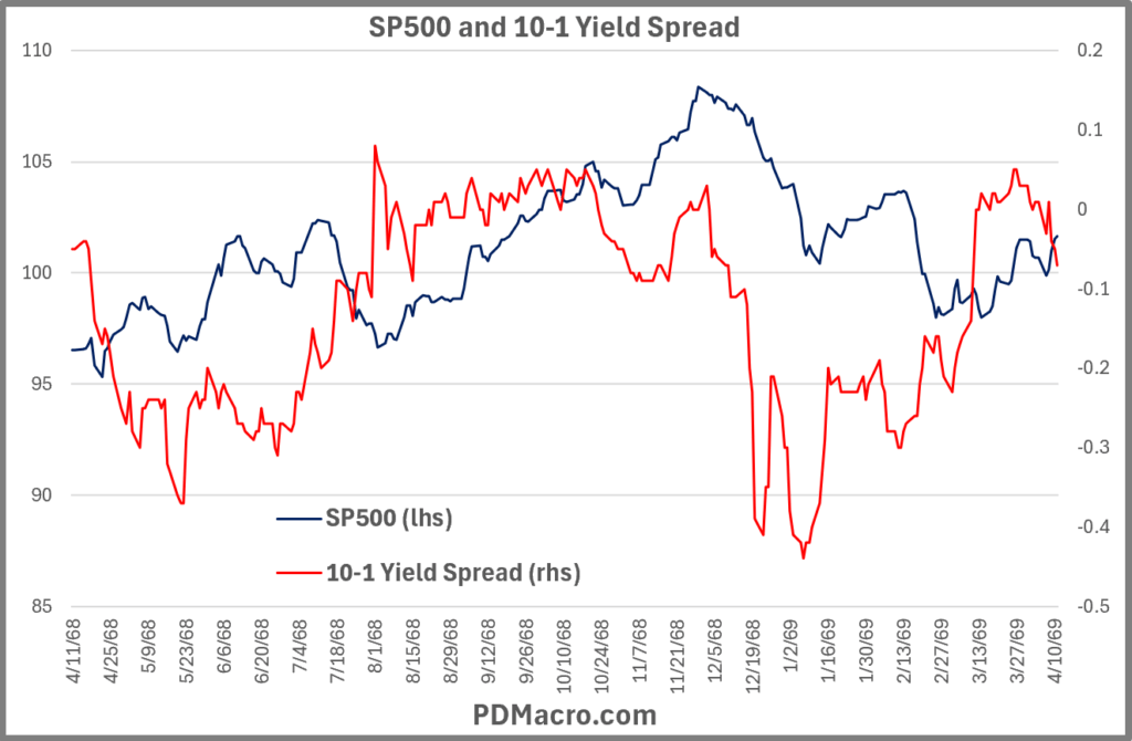
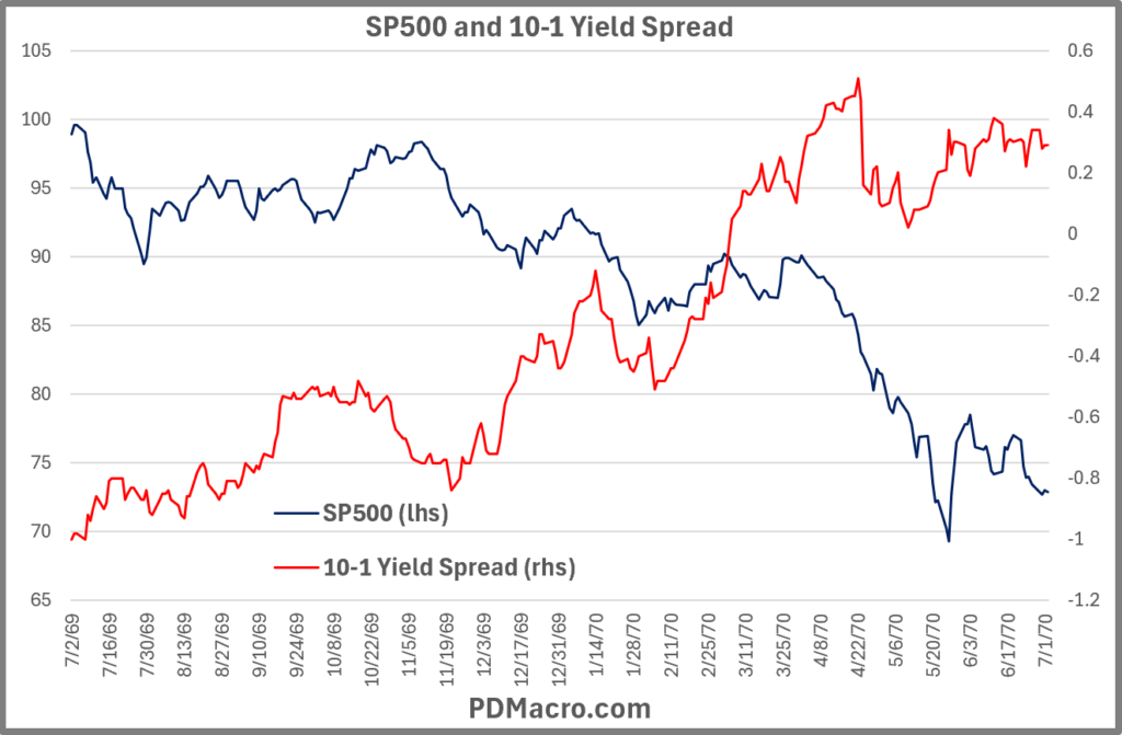
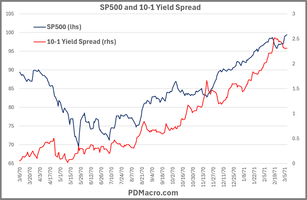
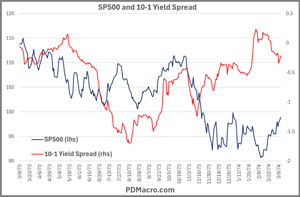
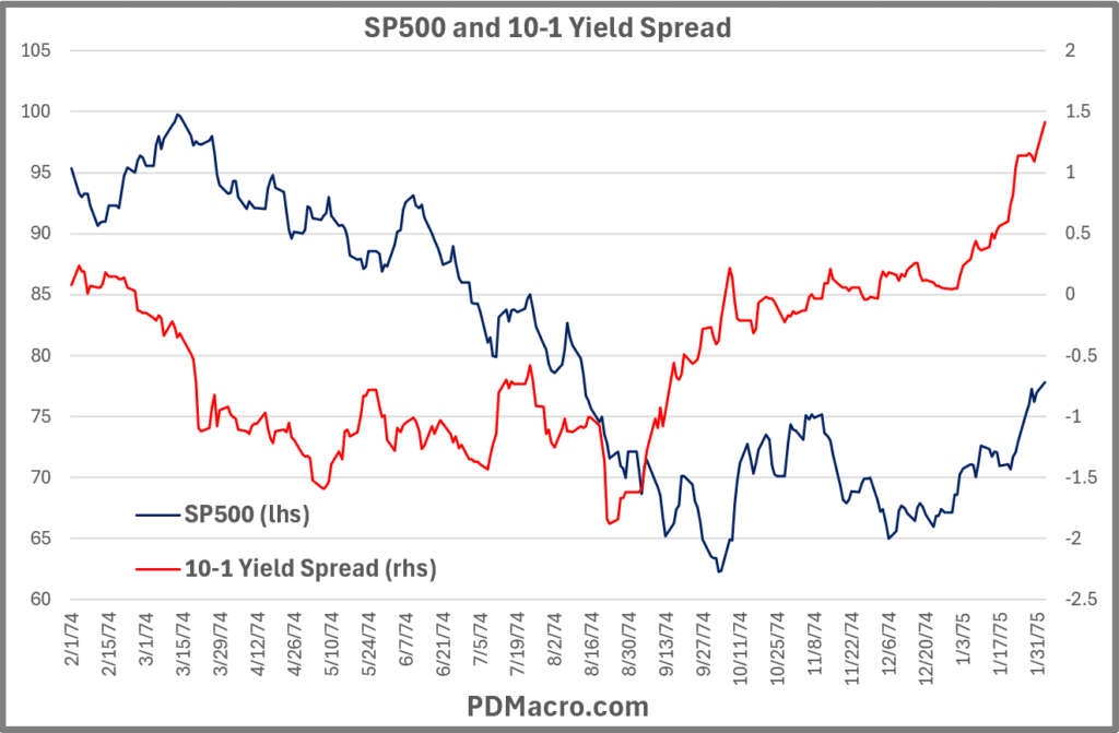
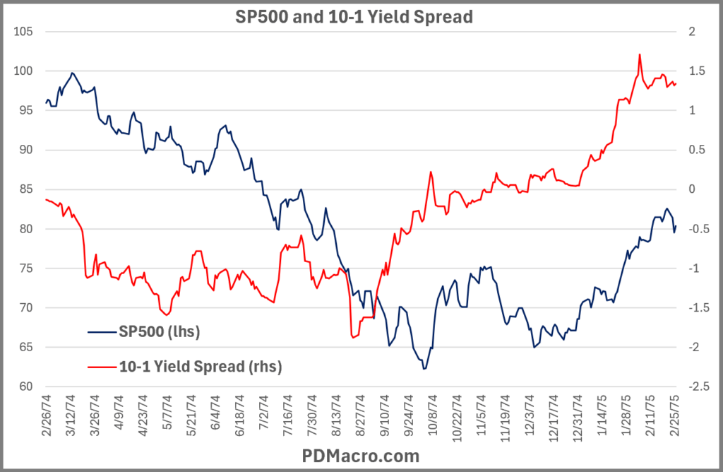
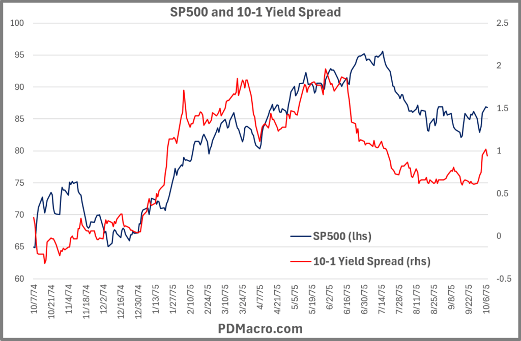
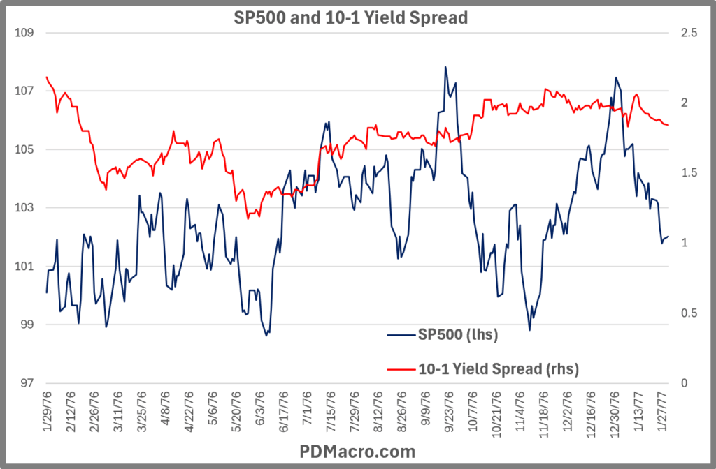
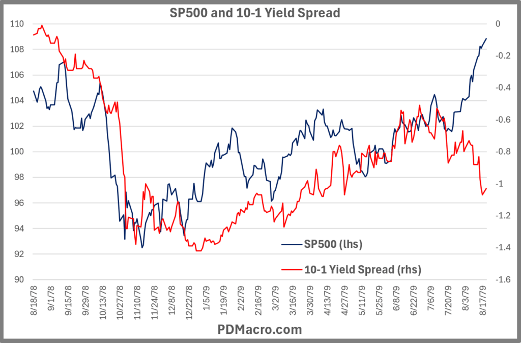
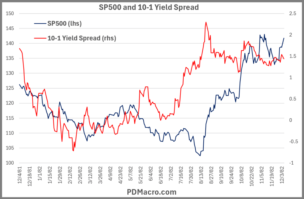
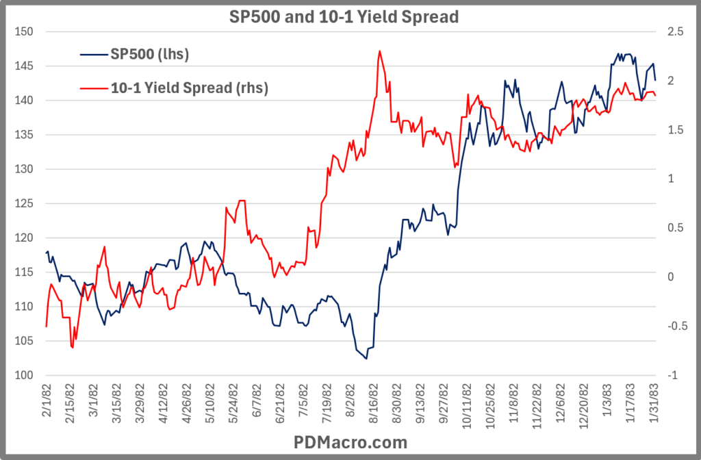
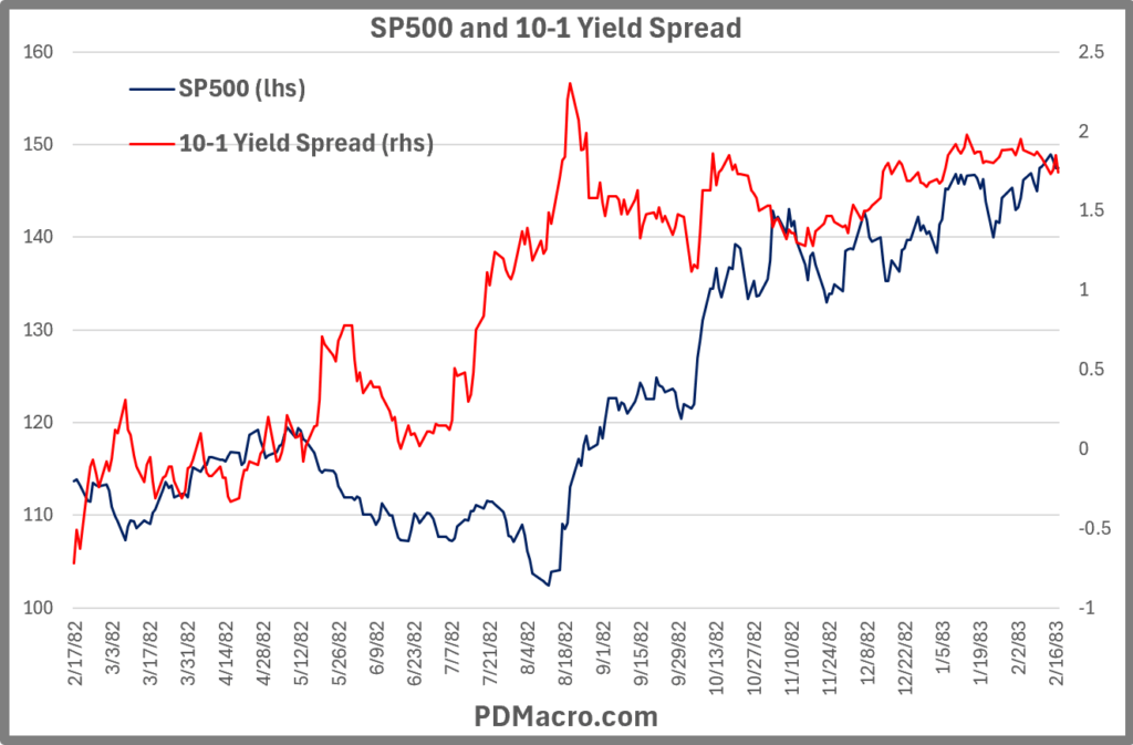
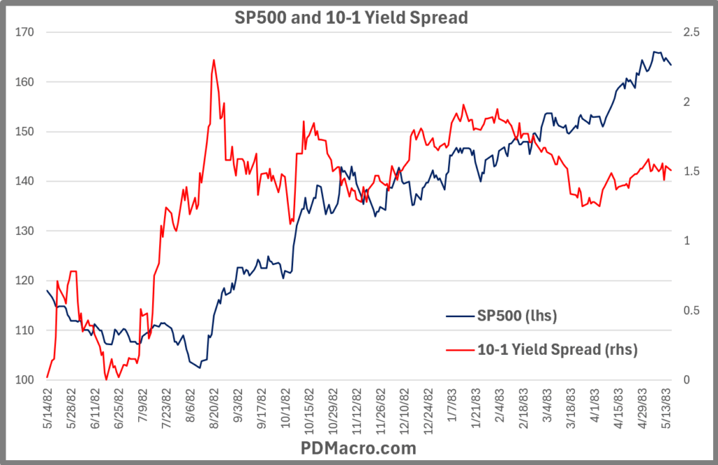
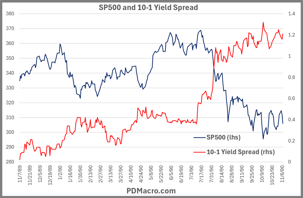
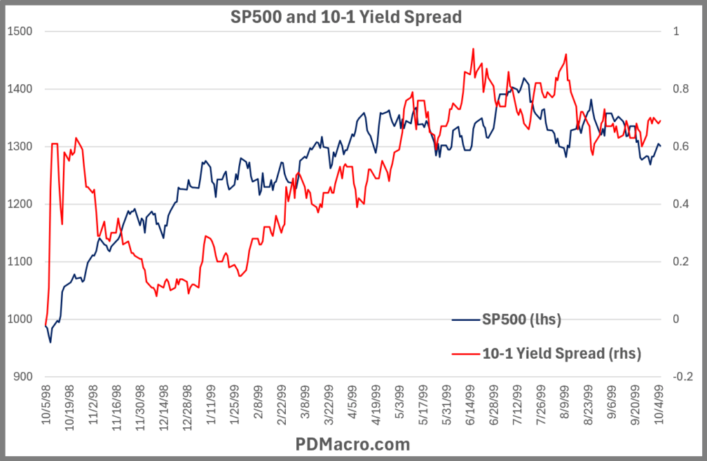
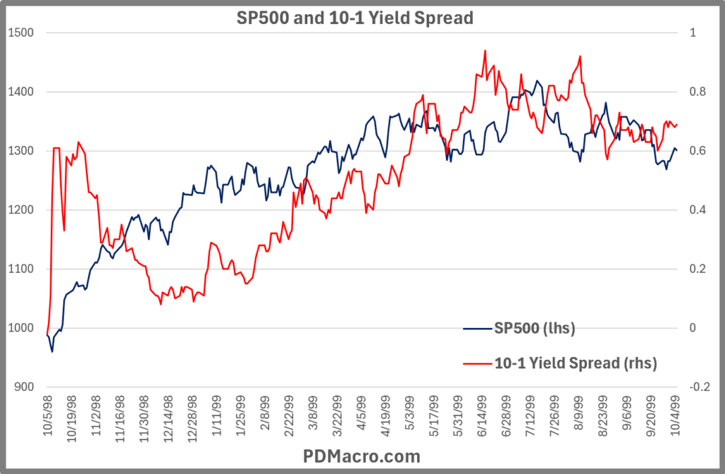
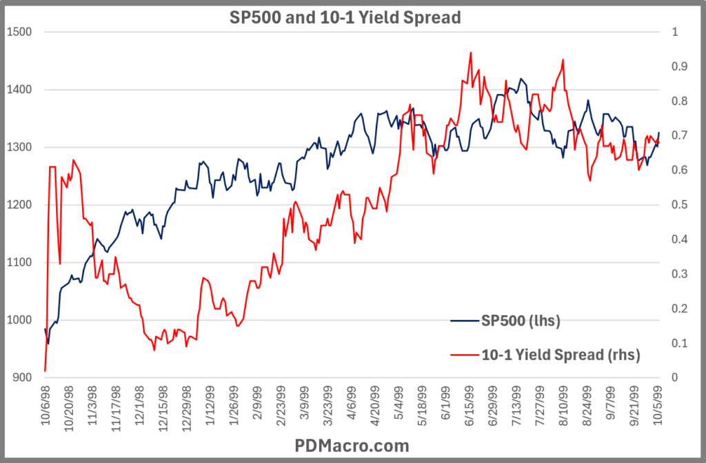
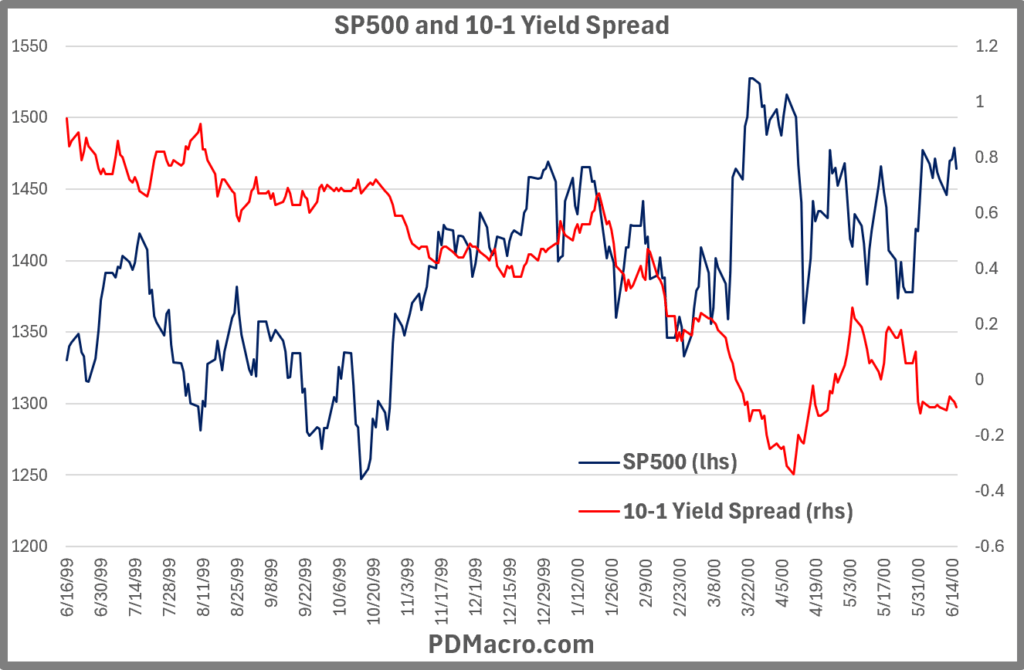
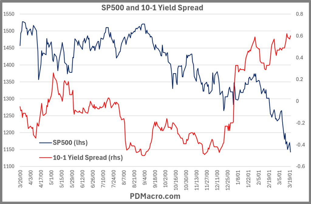
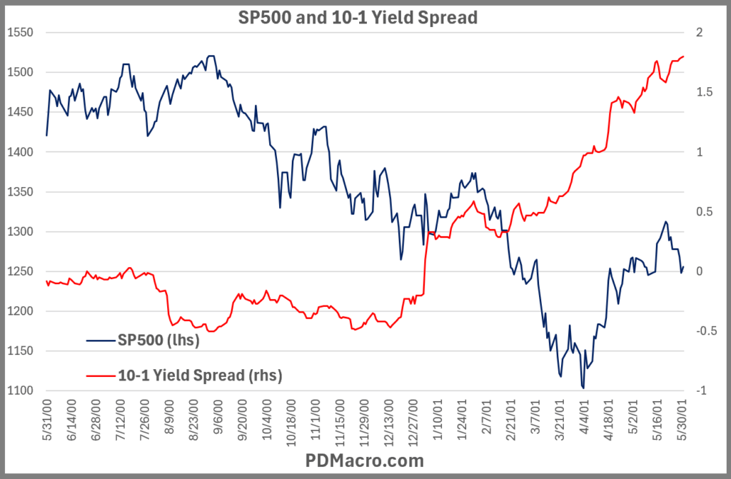
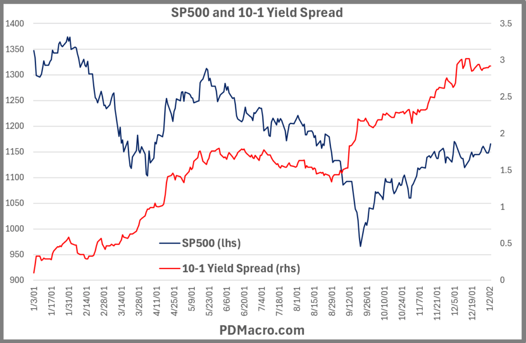
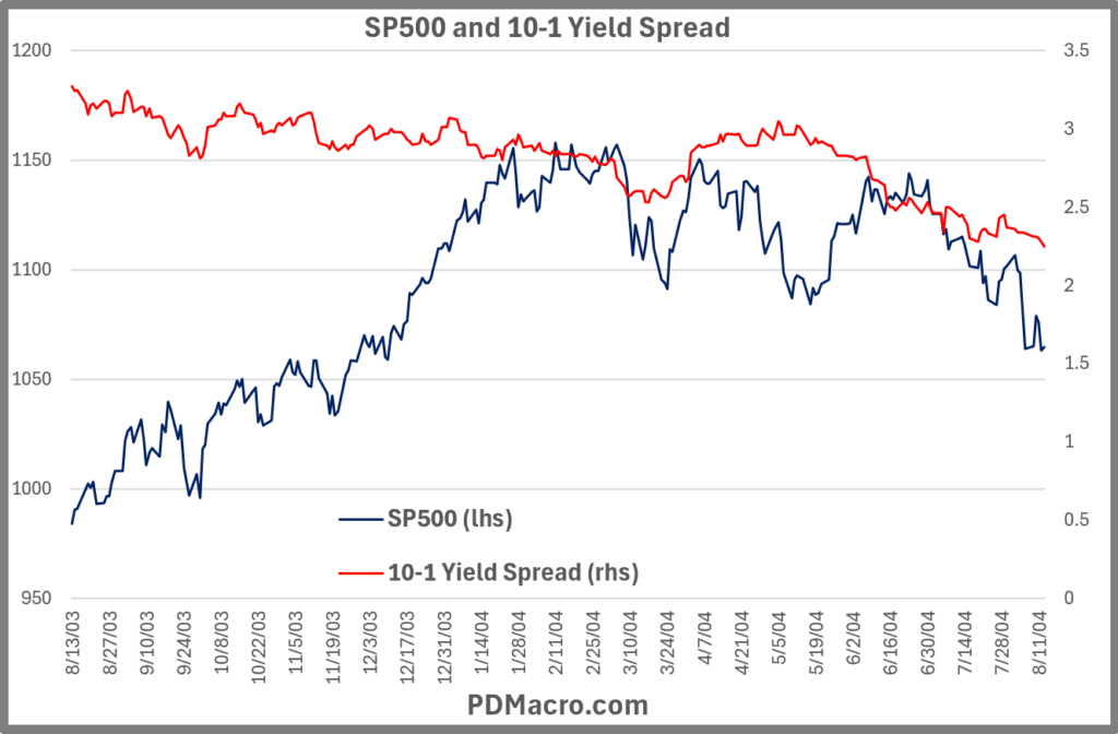
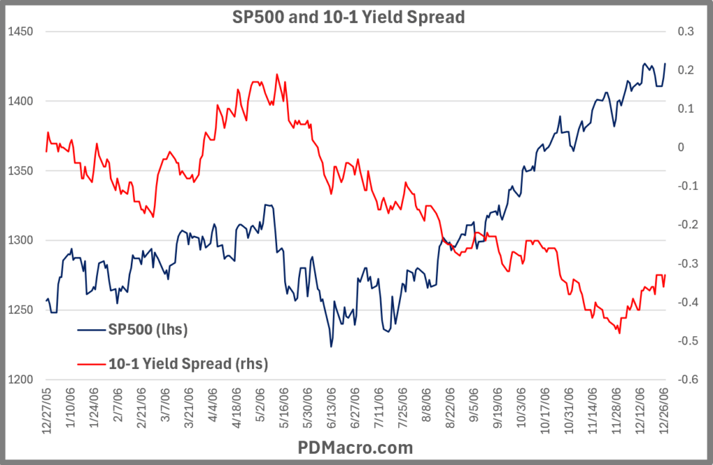
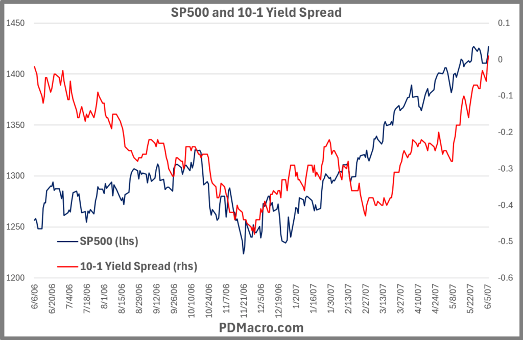
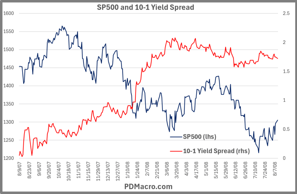
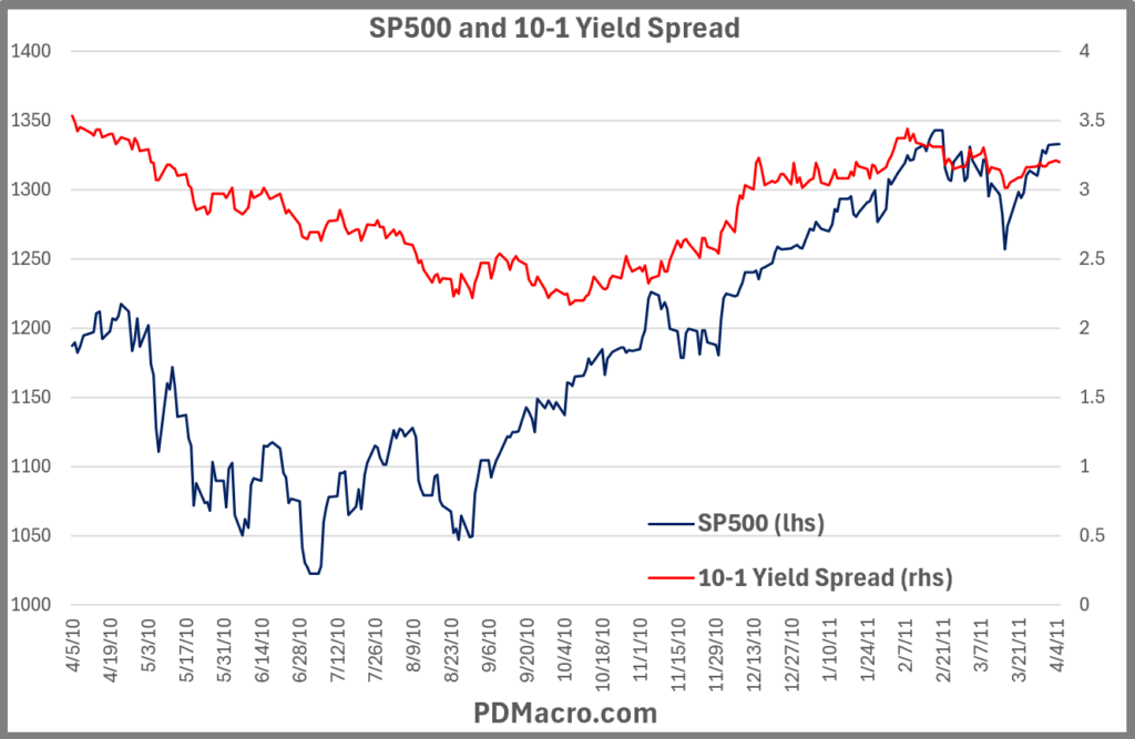
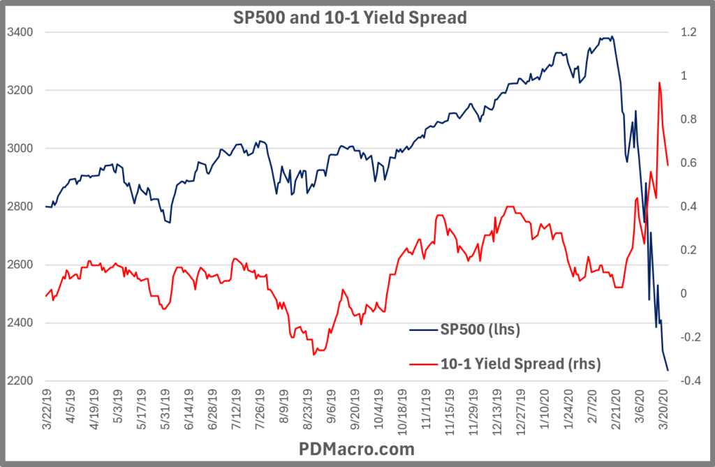
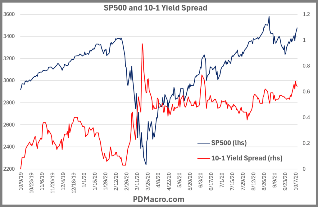
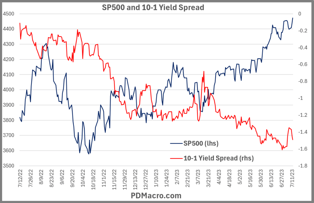
So let’s get into the charts. In each of these charts we show the yield curve and the SP500 from the day of the phase to the same day a year later. It is worth your time to go look at other time intervals, but for the purpose of this piece we chose 12-Months. And in case you were wondering this post is very chart heavy.
In each section we have a table and then five charts. In the table it has the data from each phase. If the phase is the same date as the next phase then they are bolded. So if the first break and the inversion are the same then they are bolded.
For instance in the first example of the 1965 yield curve inversion we have the Peak, First Break, Inversion, Trough, and when it turns Positive. We have the dates of each reading, what the spread was on that date-0.98 would be 98bps), the SP500 price for that day and the same day a year later, and then the percentage return you would have gotten if you have bought the close that day and sold the close one year later. If you have bought stocks at the Trough, or the bottom, of the inversion and held for one year you would have been up 21.92% one year later. Doing the same when it first went negative at the First Break would have yielded a -15.23% return.






































Yield Curve and SP500 Statistics Across All 14 Interest Rate Cycles Since 1962
Hopefully you find the visual representation of the yield curve and SP500. We tend to be quite visual and seeing how things actually move is helpful vs just some informative stats. With that said we also love the numbers to see how each cycle was different from the others.
Here is a table of how the SP500 did in each interest rate cycle from each phase of the yield curve, and then the summary stats at the bottom. And for a bit of clarification in the Win/Loss row a 12/2 means 12 positive returns and 2 negative returns.

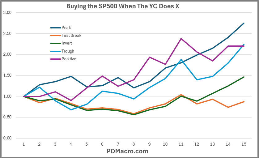
In this next chart we take that data and show the cumulative equity curve for each phase. Buying stocks when the yield spread has peaked does the best, and it should since usually that is in the early stages of an expansion. But buying stocks when the curve goes from negative to positive also has an edge along with buying the trough. Of course buying the bottom is hard/impossible, but buying when the long end is higher than the short end is simple to do. The worst strategy is to buy stock when the yield curve has its first break into inverted territory. The 12-Month returns are consistently negative, but even this one has a lot of variability with both double digit gains and losses.
In this next table I used the Excel Date math to calculate how many days were between each phase. Since it is just one date minus another date it includes weekends and holidays as well as market days.

A few notes on the table. For the days in the Peak column, they are the days from when the yield curve turned positive to the new cycles Peak. The typical Trough to positive takes about six months, from the First Break to the full Inversion it is just under two weeks, but a lot of that is from the cycles where the First Break and the Inversion occurred at the same time. Overall though you can see that cycle to cycle can vary considerably. Also worth noting is that since the mid-80’s it would see like cycles have gotten longer.
As you can see the curve usually has its Peak a little over one year after it becomes positively sloped. You can see a great example, maybe the most extreme example, in the chart below as the curve spiked early, and then didn’t go negative again for three years until the current cycle yield curve decline began. But he Peak to the First Break it usually takes a long time because of this phenomenon where the peak in the yield curve usually happens in the first part of an expansion.

In this last table we converted all of the spreads to bps-basis points. You can mostly ignore the reading in the First Break, Inversion, and Positive columns as they should be small since that is the beginning so they hover around zero. But focus on the Peak and Troughs to see what a top and bottom in the Yield Curve cycle looks like.
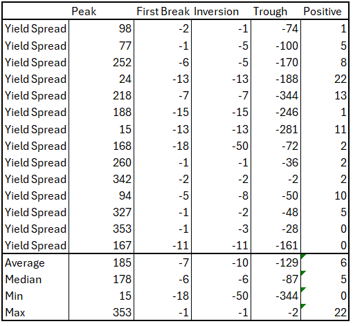
To put it into some perspective the average 10-1 yield spread since 1962 has been 95bps. So a median Peak shows a 178bps wide spread and the median Trough is -87bps. Also worth noting however is the variance in these numbers as the max was 353bps wide and -344bps inverted. And those occurred decades apart.
Next Up
Before year end I intend to turn this into a slide deck and probably do a LoudDoc for it. That is a slideshow along with me narrating and talking on each slide.
As far as yield curve related things I will be doing this same type of study on commodities, the USD, and bonds. In addition I will compile my data on how the SP500 reacts at different intervals than just 12-Months. I have the data but not in a presentable format.
One last note on the choice of the 10-1 Spread. I used the 1-Yr because the data is readily available and it is a decent compromise between the 90-Day and the 2-Year yields that are usually used in yield curve discussions. And I would love to use the 30-Year but of course we had that period where you have to make synthetic 30’s because they stopped issuing them for a minute. If you use something other than the 10 and 1 year yields a lot of these dates will be slightly different. In the case of the 90-Day it is usually only a few days difference, but in the case of the 2-Year it can be up to a couple of months. So if you are going to build a trading or timing model make sure you get the historical data so you know how your system or model has worked in the past.
Happy Trading,
P.S. If you liked this then take a free two week trial of our service. If you have any questions send me an email or find me over at Twitter @DavidTaggart
