
The SOX/SPX YoY A Semiconductor Cycle Leading Indicator
The Semiconductor Cycle
As with most sectors, especially those that manufacture physical goods, the semiconductor industry moves in cycles.
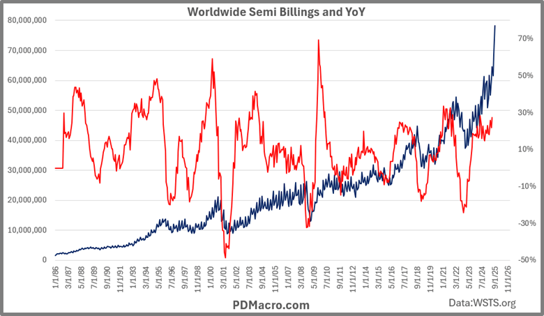
We can see this well if we look at the semiconductor revenues over time. In the chart below we have the Worldwide Semiconductor Billings Index from the World Semiconductor Trade Statistics. You can see the long-term trend (the blue line). By looking at revenues year over year (the red line), you can see the cyclical nature of semiconductor revenues. Some of the cycles are shallow, but most are quite large.
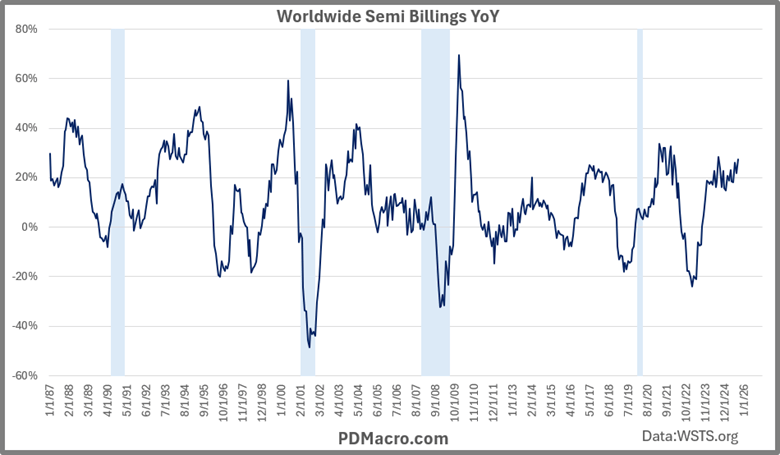
The next chart shows year over year data with recessions highlighted. With the data we have you can see that semiconductor revenues are weak ahead of each recession with COVID being an exception.
One thing worth pointing out, and this cuts across almost every cyclical tool, is that the good indicators indicate likely recessions…but they also indicate many non-recessions as well. We have all heard the joke of “XYZ indicator or model called 10 of the last 5 recessions” as if that makes it a bad tool. It does not.
What we want are tools-call them models or indicators if you want-that show when a condition is happening. In the case of the semiconductor cycle we are looking for indications of growth picking up or growth slowing down. As you will see with the coming sections this is useful because it both helps us both to find recessions and, more importantly it helps us to find moves in markets. In our case that is the primary objective, signalling a recession is just a bonus.
ISM PMI
One of the more popular, and usually quite effective, leading and coincidental cyclical indicators is the ISM PMI-Institute of Supply Chain Management Purchasing Managers Index. The data goes back to 1948 and over time it has done a good job of showing us how the manufacturing industry is doing.
If we overlay the worldwide Semiconductor Billings Index year over year with the ISM PMI we find in this next chart that they tend to be very much in sync. Not only that but most of the time, especially over the past 25 years, we find that the Semiconductor Billings Index LEADS the PMI data. This has definitely been the case over the last few cycles as the Semiconductor Index leads up and down.
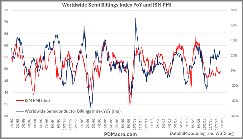
If the ISM PMI is a leading to coincident indicator, then this would imply that the Semiconductor Billings Index is a leading indicator of the cyclical turns in growth.
The current situation is interesting as the Semiconductor Billings Index is clearly showing a lot of strength while the PMI is not. In fact, in the last 36 months the PMI has only been above 50 twice. It would appear as though the only part of manufacturing showing strength is in semiconductors. We see the evidence of this in S&P sector returns as tech and communications have left the rest of the market in the dust.
Semiconductor Cycle and the Stock Market
So, we have established that the semiconductor cycle via the Semiconductor Billings Index is a useful tool to track manufacturing, growth, and by extension the business cycle, but what about markets?
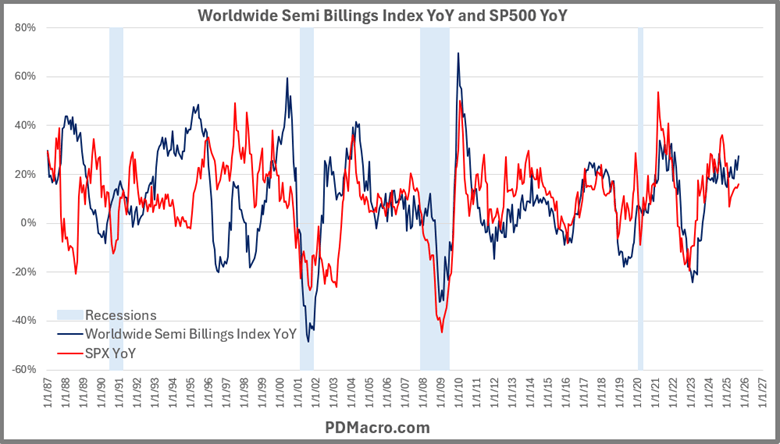
Before we get there let us look at the PMI vs the SP500 year over year. As you can see in this chart the market usually tracks the PMI quite well. Sometimes the PMI leads, usually it moves right in line with the SP500. Of course as noted above relative to the Semiconductor Billings Index, and visible in this chart with the SP500 year over year, you can see that over the past three years there has been a big divergence, as overall manufacturing has been weak while the market has been strong.

This is solved, or at least in the current cycle it is, by looking at the Semiconductor Billings Index where we see a similar relationship where the Semiconductor Billings Index leads or coincide with most moves in the SP500. Worth noting is that in the current bull move the Semiconductor Index is right where it “should” be.
The Market Derived Semiconductor Cycle Leading Indicator
The Wisdom of Crowds is a concept that says when a collection of independent people makes a guess that they are usually more accurate than a single individual. The idea has been around since Francis Galton, but it was popularized when James Surowiecki wrote a book of the same name. It is important to note that this is not the same as crowd phycology as in the Madness of Crowds. The Madness of Crowds, or crowd psychology, is referring to herding behavior, while the Wisdom of Crowds is looking at predictions based on observations, or a giant collection of guesses.
A good example of the Wisdom of Crowds is if you have a jar of jelly beans and have 1,000 people guess how many jelly beans are in the jar. In studies using similar examples the median guess is usually very accurate. An example of Madness of Crowds on the other hand would be when you do something-for instance buy stock-not because of some rational reason, but because your friend bought that stock and is making money and you don’t want to be left behind. Both are very much at play in markets, but are distinctly different.
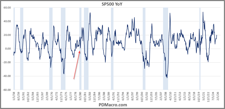
If we take the SP500 and look at it on a year over year basis, we can see that it has declined into each recession minus one in the post-WW2 era. The crowd of investors seem to be able to sniff out declining growth. Of course, you might also notice that like most cyclical tools the SP500 has called 10 of the last 5 recessions, so each decline does not mean it is a recession, but you don’t get recessions without a declining market. With this track record it should come as no surprise that this indicator is part of the Conference Board LEI-Leading Economic Index.
With that idea in mind what can we do to make a semiconductor cycle indicator using stock market data?
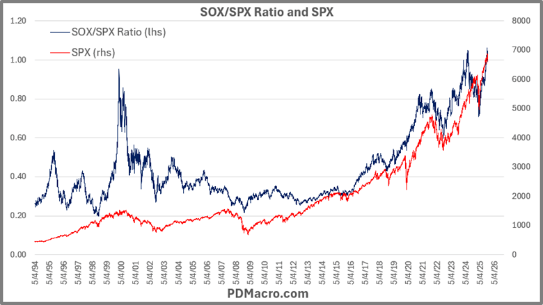
The first semiconductor stock index created was the Philly Semiconductor Stock Index-SOX- which has existed since the end of 1993. Since then, several semiconductor indices, mutual funds, and ETF’s have also been launched. But for the longest data series we have the SOX.
If we want to see how the SOX is doing versus the general market we can just look at the ratio or relative strength line. You do that by taking SOX and dividing it by the SP500. If the line is rising it means the SOX is stronger than the overall market, and if it is declining it means the market it outpacing the SOX.
In the following chart we show the SOX/SPX ratio over its history. As you can see when it is stronger than the market (blue line rising) the market is also almost always in an uptrend and vice versa. It is both a gauge of semiconductor stocks strength as well as a risk on/risk off indicator as the overall market, and not just semiconductor stocks, is stronger when the ratio is rising than when it is falling.
If we take the SOX/SPX ratio and then look at it year over year and overlay it on the Semiconductor Billings Index year over year, you can see that they usually move right with each other. In fact, the Wisdom of Crowds-the market version-actually leads almost every single move higher or lower as investors anticipate revenue growth acceleration before the ramp up or down in growth actually starts.
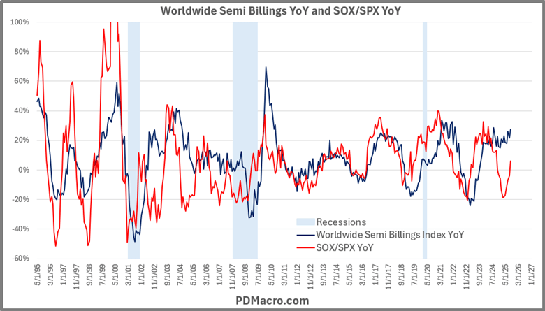
This is useful for a variety of reasons, but the primary two are that it is a true leading indicator of the semiconductor industry and as opposed to the other data we have looked at so far, it provides higher frequency data, which gives us “earlier” signals. Of course, that also leads to a bit more noise, but we like that trade.
The SOX/SPX YoY Leading Indicator
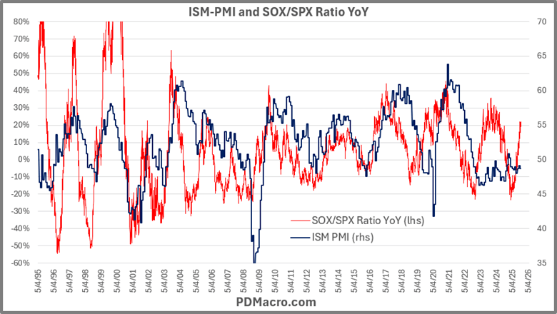
Using daily data we can see how the SOX/SPX YoY performs against both the ISM PMI and the SP500.
In the first chart we have the SOX/SPX YoY and the ISM PMI. The semiconductor cycle leads almost every move in the PMI, and more importantly right now is that it is also catching the AI buildout while the overall manufacturing industry has been in a long slowdown. As the AI buildout and the internet of things continue to grow we can expect that the semiconductor cycle will only grow in importance in the coming years.
More importantly for our uses the SOX/SPX YoY leading indicator also leads the SP500 up and down more often than not. We can see that in the chart below that shows the two data series using daily data.

Simple Backtest of the SOX/SPX YoY Leading Indicator
To check the concept out we look at what would happen if you bought the SPX at the bottom of the semiconductor cycle and sold at the top each time. We also look at buying at the top and selling at the bottom.
As you can see in the chart below of each cycle since the data began, more than all of the positive returns from the SPX are gained when the SOX/SPX YoY indicator is moving higher from the bottom. When it is moving down from a peak we see slightly negative returns.

In the average bull cycle the SP500 went up 26.16% and in the average bear cycle it went up 0.68%. The best bull cycle saw it up 49.9% and the worst bull cycle, the only loser we have so far, was down -9.16%. The worst bear cycle on the other hand was down -39.8%.
This test is both simplistic and unrealistic, at least as is. How do you know it is “THE” bottom or “THE” top? That is for you to figure out. But if you look at other cycle tools as well as use some simple trend following tools you won’t get “THE” top or bottom, but you can get close enough to make this tool really useful.
If we look over its history, we can also look at the cycles themselves to try and approximate where it is likely to go both from peak to trough as well as by duration.
The average bull cycle lasted 446 trading days, and the average bear cycle lasted 495 trading days. At the extremes the longest and shortest bull cycles were 835 days and 165 days, and the longest and shortest bear cycles were 1042 and 340 days.
If we take the average peak and the average trough, we can see the average range to see what should be considered high or low. Combined with knowing how long the average cycle is, that is enough to give you an idea of how long and how far the cycle should go before it is likely to turn.
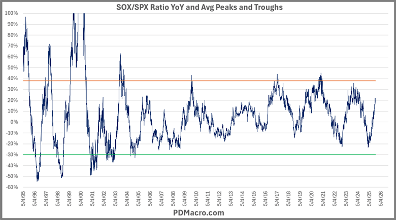
Looking at the average peak and trough, we get the chart below. We took out the top from 3/13/2000 because it was a HUGE outlier, and if anything, the cycles have moderated since then. But the purists might not like that, it is of course up to you. Since the dotcom crash, you might want to change the peak and trough lines as the cycles have seemingly moved into a tighter range, but we like it as is. As you can see it shows what would be considered the high and low end for a move. The closer you get to either line the higher the odds are that it will turn soon.
What The Semiconductor Cycle Says Right Now
As you may have noticed we are currently in a seemingly insane AI buildout. Datacenters are springing up like weeds, but these weeds use as much power as medium sized cities. And all we get are higher and higher revenue numbers out of the semiconductor manufacturers that only a few years ago would be considered all but impossible.
NVDA has a market cap of over $4.5 Trillion dollars and makes up over 8% of the SP500. In Q3 of this year it had over $51.2 Billion in revenue and they expect $65 Billion next quarter. Jensen Huang the CEO of Nvidia says he doesn’t see any AI bubble because the demand is so strong.
If you believe the bulls, we are only halfway on the trip to the moon. If you believe the bears we are in a deep recession and the AI bubble is about to pop.
You might not be surprised to find that we currently find things a bit in between the two camps. Yes, the AI buildout is in a bubble, but it could go on for some time. Yes, the SOX/SPX YoY indicator is close to the top of its range, but it still has space to go and not be an outlier.
Perhaps more importantly it is worth noting that we still think the semiconductor cycle is real and that despite the current situation we will see the cycle go up and down while the secular uptrend remains intact.
Remember this chart from earlier? The blue line-semiconductor revenue-just goes higher over time, but the line is not perfectly straight. Some time in the next 12 months it is likely to slow a bit, even if it keeps moving higher.
The Thing About Cycles
One last note about cycles. Use them to your advantage but do not get lost in them. This tweet by Paul Enright is a great way to end this post.

Conclusion
There is no holy grail, but we think the SOX/SPX Ratio YoY is a worthwhile addition to your toolbox to gauge both the business cycle and the stock market. Try it. You make like it.
Happy Trading,
P.S. If you liked this then take a free two week trial of our service. If you have any questions send me an email or find me over at Twitter @DavidTaggart