The Most Important Charts In The World Part 2
A week ago we shared a chart that we think is one of the most important charts going into 2025. Today we want to look at a group of charts that we suspect you will see a LOT of in the new year as well.
US Equity Valuations And Forward Expected Returns
There are several models that attempt to forecast future stock market returns. Most of the time they are based on valuations.
It should come as no surprised that if you invest at low valuations there is more upside than if you pay at the upper end of valuations. Paying single digit price to earnings will usually do a lot better than paying 30 or 50 times earnings.
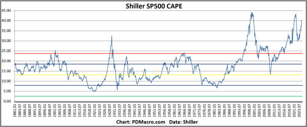
If we look at maybe the most famous of the long term SP500 models we have the Shiller CAPE Ratio. This ratio takes the average earnings of the past 10-Years and then divides it by price. It is based on an idea from Ben Graham to smooth out the earnings over a cycle.
Over time it has a great track record. If you buy when it is low then you do a lot better than if you buy when it is high. As you can see in the chart below the current readings are some of the richest of the past 135 years.

So should you sell and go to cash? Well that is where these models can bite you. This chart is done using monthly data going back to 1881. What you might notice is that all of the major overshoots lasted YEARS before coming back in. If you had sold in 1996 when it broke out of its historical range you would have lost another 4-5 years of great returns. In fact the ensuing recession only took the SP500 back to 1997 on a total return basis.
If you had sold the next time it broke out of the historical range you would have sold stocks in 2014….ten years ago. In case you have been on a deserted island the last 10 years the SP500 is up 300% since then.
Relative Returns and Risk Premiums
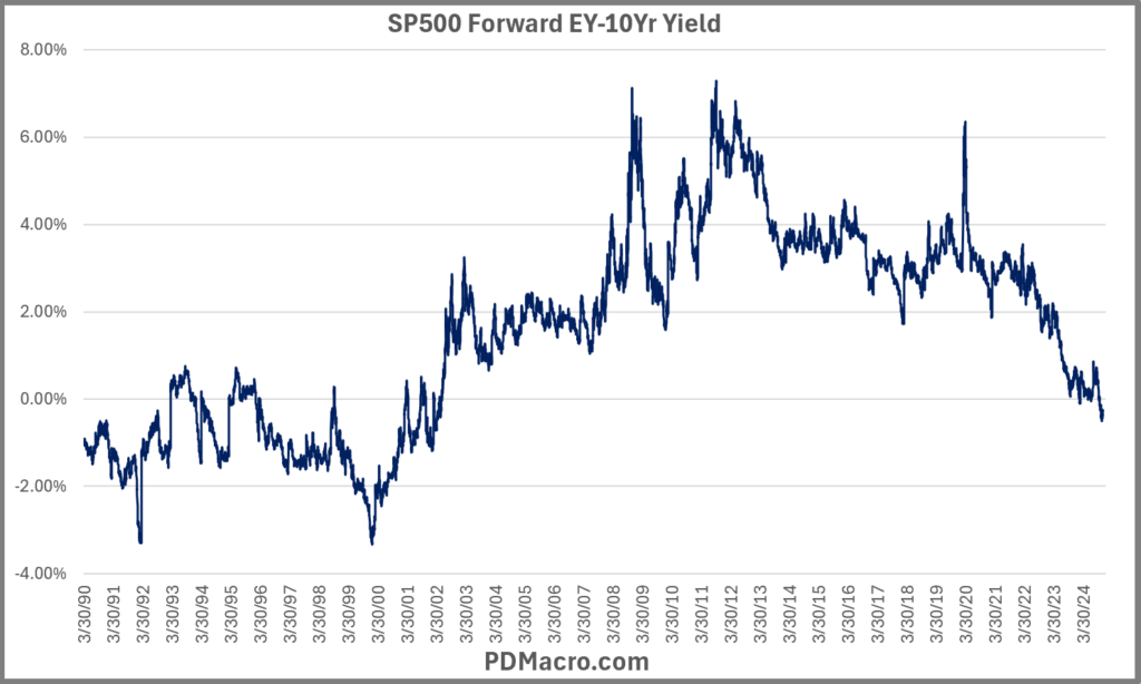
Another way to look at long term valuations and future expected returns are by using risk premia models. Maybe the most used model is made by taking the forward earnings yield and subtracting the 10-Yr Treasury Yield.
If you do that then you get the chart below. It is better to be buying stocks when it is high than it is when it is low. And right now it is negative as the 10-Yr yield is higher than the forward earnings yield on the SP500.

If you run a scatter plot of 3, 5, and 10 year returns you will find that there is indeed an edge in buying when the spread is high vs when it is low. But as you look at that chart and the date axis again you might notice something. In the 90’s it went up and down but the levels were not comparable to the last 25 years when up until the last two months the spread was always saying be long stocks.
There are lots of ways to tweak the model to make it useful. Something like Bollinger Bands or a regression model can work, but just going off the chart shows that it is not just a clean “buy here and sell here”…not at all.
Investor Positioning
There are a lot of ways to look at investor positioning, but most of them look at shorter term data like futures COT data, mutual and ETF fund flows, and options metrics. But these are more for tactical trading and not long term asset allocation. It turns out we have some great long term data.
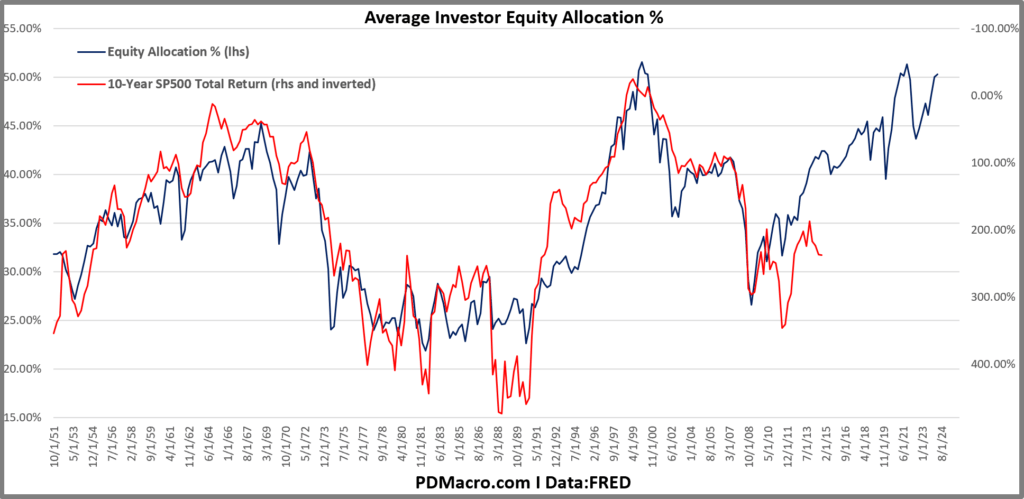
For long term metrics we go to the Feds Flow of Funds report and get the data via FRED. The equation to show the Average Investor Allocation to Equities is the following.
Investor Allocation to Stocks (Average) = Market Value of All Stocks / (Market Value of All Stocks + Total Liabilities of All Real Economic Borrowers)
In the chart below the blue line is the allocation and the red line is the realized 10-Yr total return of the SP500 from that date. So the red line is always lagged 10 years back.

As you can see the relationship has historically been very good. In fact up until now it might very well be “The Greatest Predictor Of Future Stock Market Returns” , at least that is what Jesse Livermore from Twitter called it when he wrote the piece that brought this model to light.
So what is it saying right now? It is pointing to negative total returns over the next 10 years from the SP500. But despite the relatively tight fit there is an issue with this model as well. 10-Years is a long time, and most investors cant sit through 2-4 years of underperformance because a model was very good but not perfect. Also as with all models “what if this time is different?”
Problems And Solutions
We don’t have a holy grail, we wouldn’t tell you if we did, but we do have some ideas based on research, experience, and intuition that could help you make these models useful to you.
For the CAPE model, or any model you can duplicate for several different stock markets, you can make better use of them by buying the cheapest markets than by using the model to time just one. Meb Faber wrote a paper on this idea and has incorporated it into some of his ETFs.
Another tool you can implement is to pick a long term trend indicator that matches up with how you look at the world. For a lot of people long term would be the 200-Day moving average, for others it would be a lot longer or shorter. Figure out what works for you and overlay it with valuations. When valuations are at the upper end of reasonable maybe just stick with the trend until it ends, then change your allocation. Most of you, even large fund managers, can afford to give up a few percent at the top of bottom but catching the middle by using trend tools. Oh and you can and should back test this until you find a good compromise.
Use valuation tools as a rough guide, not as a fixed rule. If you are an active stock picker then pay attention to where we are in the valuations cycle but keep doing your thing. At some point you will see things stop working and you can start to move into different types of stocks. Obviously an expensive market can get not just more expensive, but insanely more expensive. We could write a book on this paragraph, and other people have, but being aware of forward expectations can be helpful to almost any investor.
Anyways as the title in this piece says these are some of the most important charts in the world right now and you will be seeing them a LOT over the next few months. In aggregate US stocks are not cheap right now, but this time is always a bit different so as they say “you do you”.
Happy Trading,
P.S. If you liked this then take a free two week trial of our service. If you have any questions send me an email or find me over at Twitter @DavidTaggart
