
Alternative Data In The Age Of The Rona
After the Utah Jazz vs OKC game was cancelled and the world changed a lot of different companies started to provide a lot of interesting datasets that were not previously available. Some are only going to be available until the pandemic ends, while others will likely be available for a lot longer. Since the pandemic is going to last at least a few more months, and more likely a few more years at some level, it is worth your time to look at this data and equally important learn how it is calculated and what it is really looking at.
For instance a few weeks ago (today is 9/10/20) many people were talking about the JP Morgan Chase credit card data. It showed spending was going fine despite the Federal pandemic unemployment assistance running out for 30 million people. Coming it at up to an extra $2,400/month per person that fact that the credit card data appeared to be doing fine was surprising. Well we then saw the Facteus data on prepaid cards and the spending had fallen off the proverbial cliff. That was a great warning that things were potentially slowing.
In addition to Facteus we have been able to access TSA data for checkpoint throughput, Opentable data for reservations, Google and Apple mobility data (yeah sometimes tech companies tracking your every move is helpful), Placer.ai with retail impact for different brands, foot patterns by state and industry by SafeGraph.com, global ecommerce orders by Klaviyo, and many others. Brent Beshore from Permanent Equity put together a great page with different data here (the page that this link pointed was eventually removed).
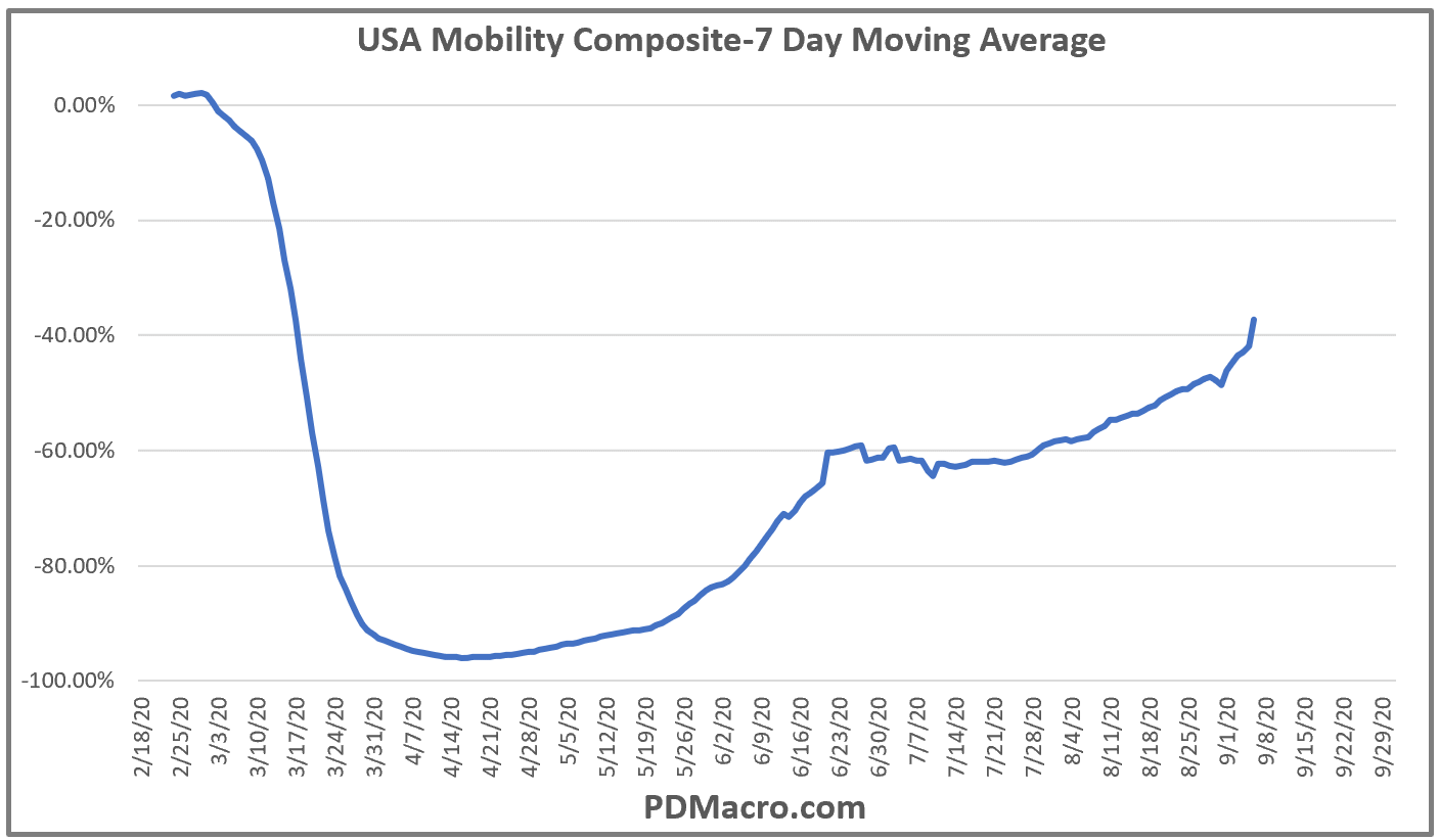
Some data is of course more useful and/or more accessible than others but we have had a lot of success in tracking different things using some of the datasets. For instance we have our own “Mobility Index” which is composed of the TSA Throughput data, the Opentable USA data, and the Google Mobilty Workplace Index for the United States. As you can see in the chart below it has been improving quite a bit over the last few weeks.
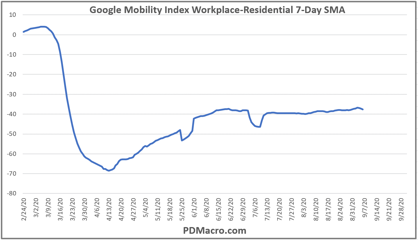
Another indicator we have constructed is what we are calling the WFH-Work From Home Index. Here we take two different Google Mobility Index series, the workplace and residential, and create a spread by subtracting the residential from the workplace. As you can see in the chart below this index has been flat for three months now indicating that a lot of people are still at home due to both working from home as well as being unemployed. This will be a useful index to track as we can see if people are going back to the workplace or not. (By the way if you decide to use the Google data you might find the link to the spreadsheet doesn’t download all the way anymore. You need to use a different program to access it. I have been using Microsoft Power BI but Tableau and other similar programs should also work.)
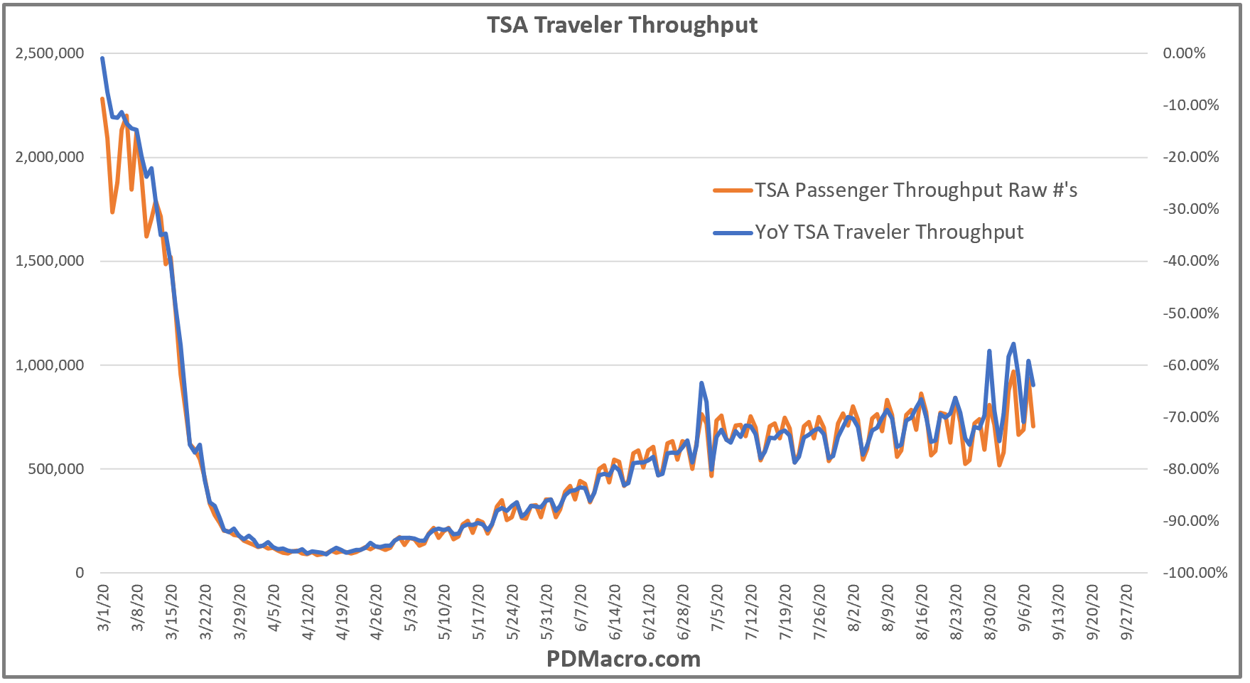
I will end with this chart of the TSA passenger throughput data. I like this data for a few reasons. One is that flying represents both business and leisure and despite the drop in costs to fly over the last 30 years it still leans upper middle class and higher. This segment also has the most spending power. So if more people are going through TSA then more people are going places, and most likely things are getting closer to “normal” whatever that will look like in the future. But my favorite thing about this data is that because it is a government agency we would not be surprised at all if they continue to publish it after we have a vaccine and the world is past this stupid virus. I love data so a new dataset that might be with us forever is a great thing.
Looking at this chart we can see that while it was volatile at the end of August and into Labor Day, the reality is that flights have been mostly flat since mid-June. Not a great sign but the last few weeks are looking up. Between this and the improving Opentable data the next few weeks should be very telling as to how the fall and back to school are shaping up.
If you have not done so already you should go look at the different datasets that are our there and see what insights you can gleam. In a few cases you might notice some really interesting trends in a few industries, and in a couple of cases even figure out what one or two companies that data represents. As we just displayed in this note you can definitely get some macro insights into the overall economy, not just in the US but in any country with a lot of cell phone usage. One last thing-the less people that are tracking one thing the better chance you can gain an edge by figuring out how to use it. Everyone knows how to pull up a chart of the 10-Yr yield or the SP500, but not everyone has actually put in the time on the new alternative datasets that are freely available. None of these will make you the next RenTech but they can still be quite helpful.
Happy Trading and Be Safe,
P.S. If you liked this then take a free two week trial of our service. If you have any questions send me an email or find me over at Twitter @DavidTaggart