
A Short History Of The Growth Inflation Framework
On the front page of our website we go over the basic version of our process. The first two steps involve figuring out how close we are to a recession and where are we in the business cycle. A large part of our process for the second step involves the growth/inflation matrix.
The other day we got an e-mail from someone who had seen the site asking, in a very accusatory manner, why we copied XYZ firm. Seems like a good time for a short history of business cycle research and the growth/inflation framework, a framework that we have been using at some level since at least 2003, but that has been in public since at least 1982.
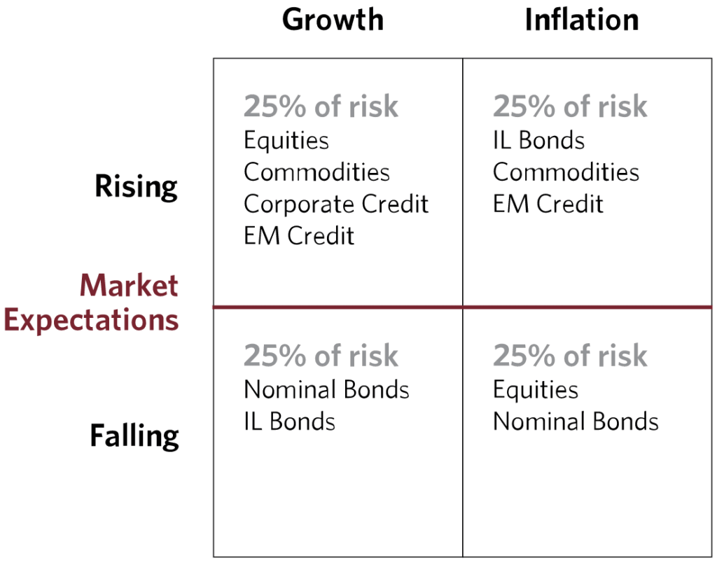
Whether you are aware of it or not you have likely seen a version of the G/I matrix. It usually looks something like this.

The basic idea is that as the business cycle shifts between the quadrants, different asset classes should do better and worse. Some assets do well with high inflation, and other assets do horribly. Some do well with strong growth, and others do well with declining growth. The next chart is the matrix with a very simple view of how it can be used for asset allocation. If you go down the rabbit hole you will find specific commodities, FX, fixed income, equity sectors, and even factors for each quadrant, there is a lot you can do with this tool.

The primary two ways to use this are to either move from asset to asset as the economy shifts into different parts of the matrix, or to have a robust asset allocation mix that should do roughly the same independent of which quadrant the economy is actually in at any given moment. If the latter idea sounds familiar it is because the largest hedge fund firm in existence, Bridgewater, has been using it for about 25 years in their “All Weather” portfolios. Basically a portfolio that will never be “the best” in any given situation, but at the same time a portfolio that should never be “the worst” either, and one that should generate positive returns in almost any environment. Here is the G/I matrix from the earlier linked to piece by Bridgewater about “All Weather.”
Despite Bridgewater being the largest firm running this type of portfolio, and doing the most work to popularize it, that does not mean that they invented it. In fact if you dig into the roots and history of the firms founder, Ray Dalio, it is logical that he came across the matrix and decided to use it.
Dalio came up in markets during the 1970’s. One obviously important aspect of the 70’s was the runway inflation we saw. During this time we saw the rise of the goldbugs and other inflation scarred investors. We then shifted into a disinflationary period that lasted at least the next 40 years. People clearly wanted to figure out how to have a robust portfolio.
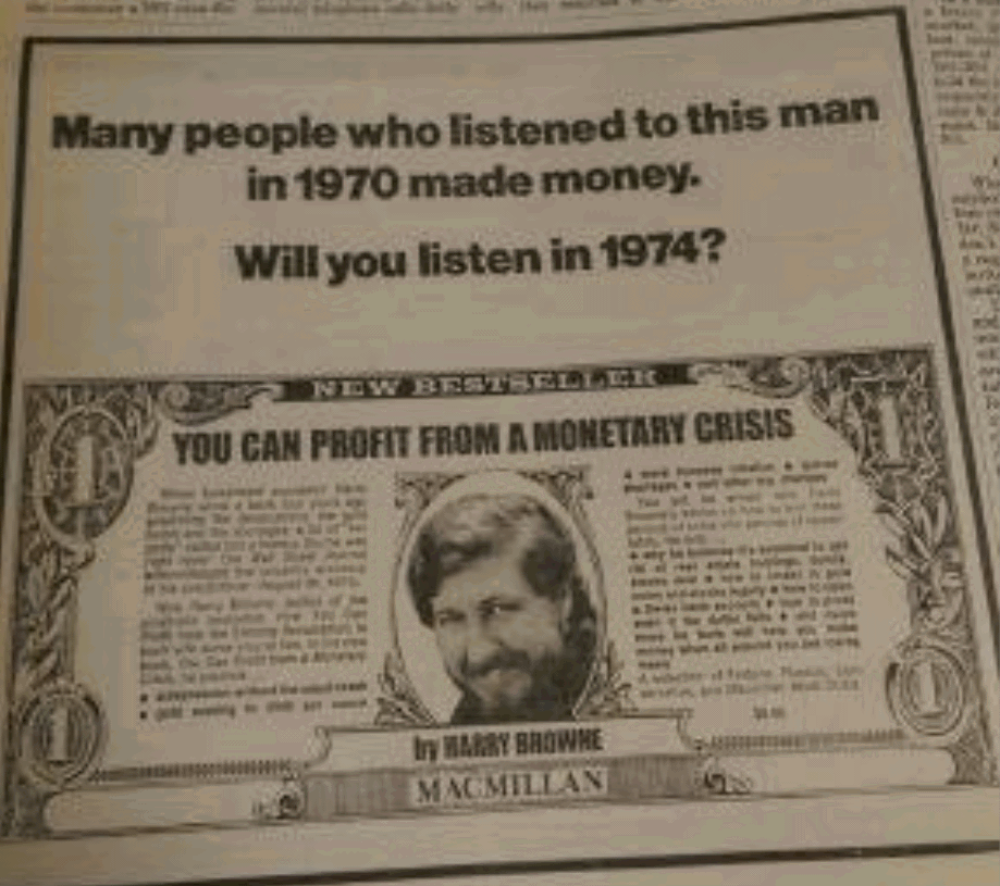
Enter a man named Harry Browne. During the 70’s Browne wrote multiple books talking about a massive devaluation and monetary crisis. Here is an ad from a 1974 Barron’s. He later ran for President on the Libertarian ticket a few times.
Around 1982 he came up with the idea of “The Permanent Portfolio.” While he did not write the book until much later he did write about the idea back then. In fact a lot of different investors worked on the question “how can we invest in a way that protects us in low and in high inflation regimes?” The inflation of the late 70’s did that to people. In fact we don’t even know for sure if Harry Browne actually had the idea first, just that he is the first one I know of to get credit for it, but it does seem like the 70’s was the hotbed for strategy development to invest across growth and inflation.
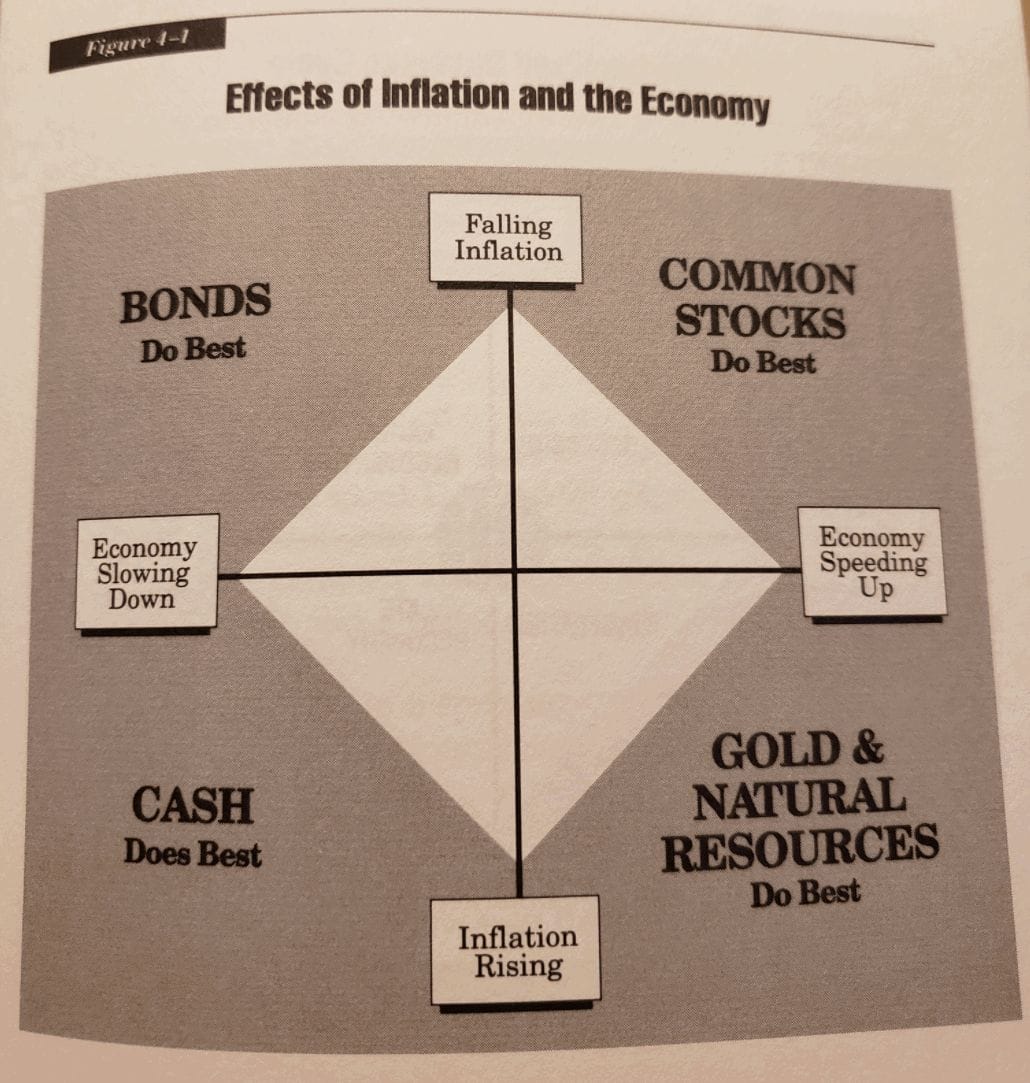
Over the years the idea grew and many different investors adapted it to their own needs. Here is a pic from Jay Schabacker’s book “Winning in Mutual Funds” where he lays out the matrix…in 1994, even though he had been writing about it in his letters for years before that. This book is the first time I had seen it.
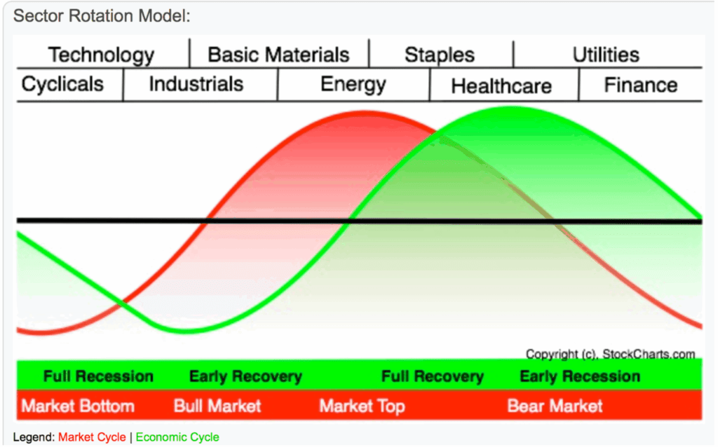
If you have done a lot of study of the business cycle you also know that the focus on growth and inflation is not unique to the matrix. For instance we know that Geoffrey H. Moore, the “father of leading indicator” worked on leading indicators for both growth and inflation. He worked at the NBER for years and later started ECRI which to this day maintains leading economic indices for both growth and inflation. Sam Stovall from Standard & Poors is another one who did a lot of work showing how different sectors do better and worse in different parts of the business cycle. If you have ever seen a version of the following chart then you can thank Sam for popularizing it.
The growth/inflation matrix really started getting popular in the internet age in 2004 when Bridgewater posted their piece titled “Engineering Targeted Returns & Risks,” and Trevor Greetham at Merrill put out “The Investment Clock.” Since then we have seen more and more research in this space. It turns out that by breaking down asset classes, sectors, and factors by where they fit in terms of growth and inflation you can improve returns, lower risk, and have a more consistently profitable portfolio. I think we all want that.
In future posts we will go over a some of the basic building blocks to measure growth and inflation. As you can guess that exercise can get as complicated as you want, but as with most things the basic blocks are simple enough and capture the bulk of the signal.